mark: A photo of Mark kneeling on top of the Taal Volcano in the Philippines. It was a long hike. (Default)
Mark Smith ([staff profile] mark) wrote in [site community profile] dw_maintenance2020-07-25 04:30 pm

Code push happening shortly!

Hi all, I'm about to kick off the latest code push, bringing live updates and tweaks to keep improving Dreamwidth! As always, we welcome your feedback in the comments.

For the information on what's going live, check out: https://dw-dev.dreamwidth.org/223659.html

Screening Comments for the night

Hi all!

I need to step away from the computer from the evening so I'm going to turn on comment screening. I think by this point we've gotten more than enough useful feedback and it's mostly just repetition on a theme here.

And, this is your once-in-a-while reminder that discourse in our public communities must remain civil. A number of these comments are getting pretty close to the line of what we consider acceptable, and we will moderate it if we need to.

Please respect that most of the people who work on Dreamwidth are volunteers and we're all well-intentioned. You should definitely assume good faith. We love to hear about your experience, but please do stay away from the invective and brigading.

Until tomorrow! -Mark

A Comment on Font Sizes

Hi all! Since this seems to be the overriding theme of many comments, I'm going to put a response at the top here instead of trying to reply to everybody.

First, the font size changes are generally intentional, and to a large degree, here to stay officially (but there are some userstyle options!) -- but please hang on to the pitchforks and let's talk about why.

Dreamwidth was started over a decade ago, and was based on LiveJournal which is over two decades old at this point. Back then, most people were building web sites for desktop PCs, on 15" CRTs that ran 1024x768 if you were lucky, and we had no idea what it meant to make something accessible. Or, well, most of us didn't.

In the intervening 20 years, a lot of things have changed. The way people access Dreamwidth has gone mobile (50% of our traffic is iOS/Android!), the types of systems people use is very different, the technologies our development staff know are different, and our understanding of how to build accessible web sites is much, much better.

So, as we've been thinking about how to continue developing Dreamwidth, we've been using that knowledge to inform the decisions we make. We want Dreamwidth to hold true to the things that we believe (transparency, no ads, etc), but we have been taking the lessons learned by the broader industry over the intervening bunch of years and applying them when it makes sense.

Specifically when it comes to font size, there are now many studies that show that 16px fonts are the minimum you should use to cover the widest range of visual needs. No, it's not perfect; much like small text has problems for many users, larger text does pose problems for some of you. I definitely am aware of that, and to those who are negatively impacted by this change, I'm sorry.

There are some options, however; you can apply userstyles to Dreamwidth in most browsers, which can adjust the font size back down. [personal profile] momijizukamori has volunteered to create an example that you can use, similar to the Widescreen userstyle, and then that should help anybody who really wants the smaller fonts: quick and dirty userstyle here.

As a second option, you can temporarily disable the changes: navigate to our beta features management page and click Turn ON beta testing for the option Temporarily revert updated journal page components.

As it says in the name, this is temporary, but if you critically need to turn this off for now -- you can do that. We expect to have this temporary disable for the next few months while we fix up any of the issues reported today, particularly the ones that make stuff look really weird (like the mobile half-width situation).

For closing, please do watch this community and the [site community profile] dw_beta community. We posted about these changes and asked people to help us build them two months ago when we released them for beta testing. If you want to be part of the iteration on Dreamwidth, and have a voice in the things we build & what they look like, please join us and be part of the process!

But even if you don't, your feedback here is welcome, we hear it, and we will continue to iterate with it in mind. Our foremost goal here is to make Dreamwidth better for as many people as we can -- and this is part of the process. Bumps and all :)

Known Issues

  • Some Celerity colors/spacing has changed. I don't think this was expected, so we'll take a look.
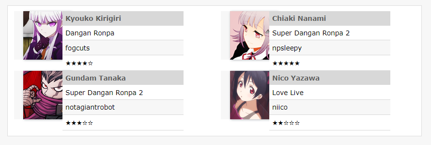
  • <table>, <td>, and <div> tags unintentionally changed in styling -- looks like we're leaking the styling changes we made in the main scheme down. I think we can fix this -- please don't edit all your tables!
  • Spacing and coloring around the page number sections on many-commented entries no longer is offset in a darker colored box.
  • Some mobile browsers are reporting a half-width page (half the page width is the comment, the other half is empty). We're looking.

Fixed Issues

  • Unexpectedly bright colors in Tropo-Purple. We'll take a look, and see if we can tone it back down! (Weirdly, the purple you're seeing now is how it was originally designed to look, but due to a bug, the color was wrong... we fixed the bug, for unrelated reasons, but we can also adjust the color!)
  • Emailed comments are getting squashed and losing paragraph breaks.
  • Icon browser sometimes showing keywords even in no text mode. This is intentional for the icon that you have selected, so you can see what the keyword is. What do you think?
  • The Widescreen user-style is broken. To fix this, please add this to the end of your style:
#content, #content > div:nth-child(2), #content > div:nth-child(1), #masthead > div:nth-child(1), #account-links-wrapper, footer {
   max-width: 100%;
}
   

In case of the worst, please keep an eye on [twitter.com profile] dreamwidth for updates.

scythiandy: (Default)

[personal profile] scythiandy 2020-07-25 11:52 pm (UTC)(link)
Posting links to show what I mean, but my page has gone from this: Before
to this: After

In addition to how the comment for replies look and the searingly bright purple now, which isn't how the color coding for this layout (trophispherical purple) used to look, it's not a pleasant thing to look at. It's taking up a lot of space on my screen just for a reply box. Everything's hugely bigger.

Edit: To add to this, please go look at [community profile] rpanons on this setting and see how utterly horrible and disjointed it looks. It's a pain to see that comm now.
Edited 2020-07-26 00:02 (UTC)
amberblaze: (Default)

[personal profile] amberblaze 2020-07-25 11:54 pm (UTC)(link)
I'm on Trophispherical Purple and the colors are entirely too bright now. It's kind of hard to look at.
peaked: CINDY. (Default)

[personal profile] peaked 2020-07-25 11:58 pm (UTC)(link)
I'm on the purple, too, and I'm glad you've mentioned this. I think if it can be toned down a little (I think the white background is what's too bright), that'd be great! The purple one is my favourite scheme to use.

(no subject)

[personal profile] amberblaze - 2020-07-26 00:00 (UTC) - Expand

(no subject)

[personal profile] peaked - 2020-07-26 00:11 (UTC) - Expand

(no subject)

[personal profile] scythiandy - 2020-07-26 00:13 (UTC) - Expand

(no subject)

[personal profile] scythiandy - 2020-07-26 00:31 (UTC) - Expand

(no subject)

[personal profile] scythiandy - 2020-07-26 00:37 (UTC) - Expand

(no subject)

[personal profile] scythiandy - 2020-07-26 00:57 (UTC) - Expand

+1

[personal profile] fulgency - 2020-07-26 01:35 (UTC) - Expand

(no subject)

[staff profile] denise - 2020-07-26 03:19 (UTC) - Expand

(no subject)

[personal profile] amberblaze - 2020-07-26 00:15 (UTC) - Expand
proofofconcept: (Default)

[personal profile] proofofconcept 2020-07-25 11:56 pm (UTC)(link)
I'm also getting some of this weird sizing mentioned in the first comment. Everything is big on some entries; on others (like this one) it's fine. (Using Gradation horizontal.)
Edited 2020-07-25 23:57 (UTC)
proofofconcept: (Default)

[personal profile] proofofconcept 2020-07-26 12:00 am (UTC)(link)
(i looked again, correction: everything seems to be big using the site skin on any entry. site skin is normal elsewhere on the site. this was also true when i tried gradation vertical.)
Edited (BRAIN NO WORK) 2020-07-26 00:01 (UTC)
lylith_st: (Default)

[personal profile] lylith_st 2020-07-25 11:57 pm (UTC)(link)
Alas, seems like the code push broke DW for Widescreen. Everything looks giant on my end and other friends of mine had reported having the same issue.

If anyone knows a way to fix it, it will be greatly appreciated.

(no subject)

[personal profile] bornandbread - 2020-07-26 00:25 (UTC) - Expand

(no subject)

[personal profile] bornandbread - 2020-07-26 00:49 (UTC) - Expand

(no subject)

[personal profile] hornless - 2020-07-26 00:33 (UTC) - Expand

(no subject)

[staff profile] denise - 2020-07-26 03:21 (UTC) - Expand

(no subject)

[personal profile] lylith_st - 2020-07-26 00:52 (UTC) - Expand

(no subject)

[personal profile] tongueamok - 2020-07-26 00:41 (UTC) - Expand

(no subject)

[personal profile] lylith_st - 2020-07-26 00:52 (UTC) - Expand

(no subject)

[personal profile] tongueamok - 2020-07-26 00:53 (UTC) - Expand

(no subject)

[personal profile] lylith_st - 2020-07-26 00:55 (UTC) - Expand

(no subject)

[personal profile] darjeeling - 2020-07-26 01:18 (UTC) - Expand

(no subject)

[personal profile] tongueamok - 2020-07-26 01:19 (UTC) - Expand
telly: (Default)

[personal profile] telly 2020-07-25 11:59 pm (UTC)(link)
In Celerity, the comment headers are grey instead of green and there's a weird gap in the left margin between comments and the sidebar? I don't even see Celerity mentioned in the beta page.
telly: (Neutral - candy sworl)

[personal profile] telly 2020-07-26 12:02 am (UTC)(link)
Also the right margin is like halfway across the page, instead of text continuing to fill the entire screen (although I'm at 80% zoom, probably a factor)

(no subject)

[personal profile] fearinahandfulof - 2020-07-26 00:06 (UTC) - Expand

(no subject)

[personal profile] proofofconcept - 2020-07-26 00:13 (UTC) - Expand

(no subject)

[personal profile] proofofconcept - 2020-07-26 00:27 (UTC) - Expand

(no subject)

[personal profile] telly - 2020-07-26 00:37 (UTC) - Expand
teal: (𝖇𝖎𝖙𝖙𝖊𝖗)

[personal profile] teal 2020-07-26 12:01 am (UTC)(link)
Not sure if it happened with the Widescreen Break, but choosing icons from the "Browse" menu is incredibly clunky and huge now. Along with everything else that is now obnoxiously huge and imo ugly to look at.
knifecollecting: (Default)

[personal profile] knifecollecting 2020-07-26 12:03 am (UTC)(link)
Yeah, everything feels REALLY BIG but REALLY CLOSE TOGETHER on comment pages and the Browse menu just feels uneven and too big.

textarea boxes

[personal profile] teal - 2020-07-26 00:55 (UTC) - Expand
skittering: all icons by me, go ahead and steal with credit (Default)

[personal profile] skittering 2020-07-26 12:01 am (UTC)(link)
Everything is much bigger in a... non-aesthetically-pleasing way, though I'm able to remedy it some by taking my browser zoom down to 80%.

An actual issue: The notifications I'm getting in my inbox show others' replies as all one big lump of text, not reflecting paragraph spacing like it used to. This makes it super hard to read. :x

(no subject)

[personal profile] roadrunnertwice - 2020-07-26 00:59 (UTC) - Expand

(no subject)

[personal profile] fae_of_the_rose - 2020-07-26 01:03 (UTC) - Expand

(no subject)

[personal profile] skittering - 2020-07-26 01:03 (UTC) - Expand

+1

[personal profile] scythiandy - 2020-07-26 01:12 (UTC) - Expand

(no subject)

[personal profile] earthshatter - 2020-07-26 01:00 (UTC) - Expand

ignore this

[personal profile] mannerless - 2020-07-26 01:01 (UTC) - Expand

(no subject)

[personal profile] arf - 2020-07-26 02:46 (UTC) - Expand
winscenario: (Default)

[personal profile] winscenario 2020-07-26 12:01 am (UTC)(link)
Everything is ridiculously huge, comments and reply boxes take up way too much space on screen. I get wanting to add in the option for bigger font but is there no way at all you could've added an option for users to choose between the two options, rather than just benefiting a handful to the detriment of the majority?

(no subject)

[personal profile] winscenario - 2020-07-26 00:07 (UTC) - Expand
withmeinparadise: all icons <user name="crestfallen"> (Default)

[personal profile] withmeinparadise 2020-07-26 12:02 am (UTC)(link)
Wanted to let you know I love how big the icon picker is now! Not wild about the size of everything else, but this is a convenient change for me. :)
empires_heir: (Default)

[personal profile] empires_heir 2020-07-26 12:10 am (UTC)(link)
I had to log into one of my paids to check this, and I'm +1 to this - it's back to how it was the last code push or the one before where I can actually see what icon I'm picking instead of 1/3rd or 1/4th size.
fearinahandfulof: (Trance)

[personal profile] fearinahandfulof 2020-07-26 12:04 am (UTC)(link)
I'm using the Celerity site skin, and I've suddenly got a bunch of white space on the right - I think it's around a third of my monitor screen. I'm on desktop, FWIW. And yeah, the comment headers are grey now.

[Edit: screenshot]
Edited 2020-07-26 00:41 (UTC)
ravenna: (Default)

[personal profile] ravenna 2020-07-26 12:04 am (UTC)(link)
oof, that sizing is not aesthetically pleasing. i do understand if it's going to mostly stay, since i can see that having one skin that works on mobile and desktop is beneficial, HOWEVER -

a) +1 the purple skin burns now ow ow

b) would it be possible to make the font size for the Entry tags: line smaller? now posts that have more than a couple tags have a massive honking chunk wall of text and it's really awkward.
ravenna: (Default)

[personal profile] ravenna 2020-07-26 01:10 am (UTC)(link)
replying to myself to say i'm digging this "show more" toggle button on preview pages. no clue if it works yet because i haven't replied to any very long comments, but i like that it exists, and the idea behind it!
prospitian: (15)

[personal profile] prospitian 2020-07-26 12:06 am (UTC)(link)
i think maybe some of the default settings for divs got changed in a way that affected a bunch of custom code/layouts i had set up? best example i have offhand is this one, which looked like this and has become this (screenshot). i'm on the latest version of firefox on windows btw!

i imagine the solution if this is permanent and intentional is to manually override the background and border, but i admit i'm hhhoping this wasn't supposed to be universal because that's a lot to fix for all my used and distributed codes...

i do actually like how wide the site is on desktop though! it'll take some adjusting to but i especially think it'll make the collapse of long threads more bearable.
Edited (browser + system clarification) 2020-07-26 00:06 (UTC)

(no subject)

[personal profile] prospitian - 2020-07-26 00:42 (UTC) - Expand
shipoutofluck: (001)

[personal profile] shipoutofluck 2020-07-26 12:09 am (UTC)(link)
other than the issues people have already mentioned re: the size of everything (it's.... big.......),

when I use tables now there's like... a white background? like, uh, so? that white box behind my stuff was not there before and it's seeming consistent with all my table use I can find.

(in general the code of several of my things is not liking this update but the tables thing is what I'm focusing on right now)

if this is intentional, that's.... ngl very distracting especially as someone who uses a lot of tables in my codes for numerous posts across a lot of journals and basically breaks a lot of stuff I use constantly.
serperior: (Default)

[personal profile] serperior 2020-07-26 12:31 am (UTC)(link)
Yeah, it broke my table for the muselist I had too, not just with that white box behind my stuff but the code got borked so that the boxes are now off-center on the gifs and the right side pushing my icons and text when originally it had enough space for four icons next to each other without doing that.

(no subject)

[personal profile] shipoutofluck - 2020-07-26 00:51 (UTC) - Expand
fae_of_the_rose: (Default)

[personal profile] fae_of_the_rose 2020-07-26 12:14 am (UTC)(link)
My biggest issue seems to be the comment reply pages. Even zoomed out to 90%, they're clunky and honestly hard to look. Commenting on the entry itself isn't too bad, but the page "reply to comment" takes you to is oddly proportioned almost.
aesthetics: (Default)

[personal profile] aesthetics 2020-07-26 12:18 am (UTC)(link)
I agree, that's my main issue as well. This (screenshot) is way over-sized in regards to the text box that we use to comment and the padding on all the buttons takes up a lot of extra space as well. It feels very clunky.

(no subject)

[personal profile] fae_of_the_rose - 2020-07-26 00:23 (UTC) - Expand
sai: (♒ regrets collect like old friends.)

[personal profile] sai 2020-07-26 12:17 am (UTC)(link)
Aside from the extra brightness on the purple site scheme, mobile looks so, so much better.

Comment boxes are great, new menus are great, and the icon picker is wonderful. This is a huge game changer for me in terms of using the site on my phone! I cannot compliment it enough.
chaoscontrol: (how is that FAIR?)

[personal profile] chaoscontrol 2020-07-26 12:17 am (UTC)(link)
When using the "no text" icon browser, are... the keywords supposed to pop up in the middle all wonky like this?

-->

(no subject)

[personal profile] chaoscontrol - 2020-07-26 00:22 (UTC) - Expand

(no subject)

[personal profile] schematise - 2020-07-26 00:24 (UTC) - Expand

(no subject)

[personal profile] reflash - 2020-07-26 00:34 (UTC) - Expand

(no subject)

[personal profile] sai - 2020-07-26 00:50 (UTC) - Expand

(no subject)

[personal profile] nonfuckingnegotiable - 2020-07-26 01:04 (UTC) - Expand

(no subject)

[personal profile] roadrunnertwice - 2020-07-26 01:09 (UTC) - Expand

(no subject)

[personal profile] chaoscontrol - 2020-07-26 01:12 (UTC) - Expand

(no subject)

[personal profile] reflash - 2020-07-26 01:17 (UTC) - Expand

(no subject)

[personal profile] fulgency - 2020-07-26 01:38 (UTC) - Expand

(no subject)

[personal profile] nonfuckingnegotiable - 2020-07-26 01:19 (UTC) - Expand

(no subject)

[personal profile] roadrunnertwice - 2020-07-27 18:34 (UTC) - Expand

(no subject)

[personal profile] redloxy - 2020-07-26 01:21 (UTC) - Expand
peaked: ELENA. (pic#13860686)

[personal profile] peaked 2020-07-26 12:18 am (UTC)(link)
I really enjoy how big things are. (Sometimes I find myself zooming things in just because my eyes have had it for the day.) I also want to say thank you for the cool comment preview and shifting the comment you're responding to up the top. I really, really enjoy this feature and have found it super valuable since it was implemented! (I also like that it lets you preview the post you're replying to as well.)

Is it possible for the icon selector to require only one click and not two? (Whether it be double clicking the icon you want or pressing "select".) I've found with my paid account I need to click the icon twice, but I've found on this account that I only have to click it once like pre-code push (and I can't remember if it's because I have an extension in place to let me "browse icons" for free accounts).
roadrunnertwice: Kim Pine wearing headphones, as someone hammers on her ceiling. (Music / racket (Scott Pilgrim))

[personal profile] roadrunnertwice 2020-07-26 01:11 am (UTC)(link)

I wanted the browser to be one-click, myself. But we're a bit constrained there: DW allows you to use multiple keywords for the same icon, so we need a way to let people select the icon first, then choose which keyword they want.

Considered making it one-click unless it's a multi-keyword icon, but then things would behave inconsistently, which can get infuriating. So, I wasn't able to come up with a good solution for that yet.

(no subject)

[personal profile] peaked - 2020-07-26 01:18 (UTC) - Expand
evilopportunityemployer: (Eh)

[personal profile] evilopportunityemployer 2020-07-26 12:18 am (UTC)(link)
I understand that the increased font size is for accessibility purposes, but it's actually having the opposite effect for me: I'm struggling to parse the text now. Is there any way that we can pick between modes? Simply zooming out doesn't help me, because that makes everything shrink down and not just the text, which doesn't help the problem of the text being the wrong size for everything else.

The icon picker also feels a lot more clunky than it used to - I can't quite put my thumb on it, but it doesn't feel right.
apshot: (Default)

[personal profile] apshot 2020-07-26 12:59 am (UTC)(link)
Honestly this is my issue too. It's making it much more difficult for me to actually read.

(no subject)

[personal profile] spunkypowerhouse - 2020-07-26 01:25 (UTC) - Expand

(no subject)

[personal profile] marlonmajesty - 2020-07-26 01:46 (UTC) - Expand

(no subject)

[personal profile] cyprinella - 2020-07-26 01:49 (UTC) - Expand
borntolove: (Whats this)

[personal profile] borntolove 2020-07-26 12:18 am (UTC)(link)
The icon browse is now taking up nearly all of my 15-inch wide screen

Can we please have a choice of the former icon browse size?
Edited 2020-07-26 00:19 (UTC)
swordprincess: (Default)

[personal profile] swordprincess 2020-07-26 12:18 am (UTC)(link)

What is this new drop-down menu in the comment window "Casual HTML/Markdown/Raw HTML")? Clicking on the question mark next to it leads to a 404 page...

witchka: ((marie antoinette) marie ; contemplate)

[personal profile] witchka 2020-07-26 12:19 am (UTC)(link)
Thanks for the updates!

Font sizes notwithstanding, it looks to me like some of the padding is just... gone? Reduced? It may just be on Tropo Purple but the comment bar with subject/username/date seem more squished and higher vertically in the bar than they were before.

Example.
postage: (Default)

[personal profile] postage 2020-07-26 12:21 am (UTC)(link)
hi! i just wanted to contribute to the voices saying that everything is way to big now (in a not pleasant way that, like evilopportunityemployer, makes it a little more difficult for me to parse and process), and second prospitian's comment on many custom codes breaking, which might not be able to be helped but... yeah. i might be mistaken, but it also feels to me as if some of the padding and borders were removed? everything feels far to large and spaced out, while some elements somehow look strangely crammed together or haphazardly tossed onto the screen to me, and it's not entirely fun to look at... i'm not sure if that's actually the case or just a matter of the other size increases but, yeah, not really a fan :(

EDIT: i also noticed when i went to go fix one of my codes just now that the preview page doesn't seem to align with the actual reality of how the code looks when i click save and see the finished page on the updated site. this makes it kind of difficult to go back and fix them myself...
Edited 2020-07-26 00:28 (UTC)
roadrunnertwice: Me looking up at the camera, wearing big headphones and a striped shirt. (Default)

[personal profile] roadrunnertwice 2020-07-26 01:16 am (UTC)(link)

Hi, is that preview on the old create entries page, or the beta one?

The beta one should be more accurate now, but I bet the old one's less accurate. :/

(no subject)

[personal profile] postage - 2020-07-26 01:50 (UTC) - Expand
queenofmourning: (Default)

[personal profile] queenofmourning 2020-07-26 12:22 am (UTC)(link)
I love the new font size! (I've had DW zoomed in for years.) Also very excited to have the markdown option. Just a heads up that the FAQ URL next to the html dropdown is still a placeholder for me.
Edited 2020-07-26 00:24 (UTC)
theskyisnew: (Default)

[personal profile] theskyisnew 2020-07-26 12:24 am (UTC)(link)
I love the larger fonts, thank you so much. I struggle with visual problems and I've often had to zoom in or enlarge screens anyway to read things, especially in small font. This will save me a lot of squinting. Especially on mobile, I can actually read things clearly!

I'm not sure if this is only supposed to be a place with problems people are having, just wanted to say, my eyes thank you for this.
disasterhearts: (Default)

[personal profile] disasterhearts 2020-07-26 05:36 am (UTC)(link)
huge same
apatia: (Default)

[personal profile] apatia 2020-07-26 12:25 am (UTC)(link)
the site is ridiculously unpleasant to look at right now. everything is too big, and even if you zoom out on your browser, things become oddly misaligned; personal codes are also inevitably breaking. it looks really bad on mobile too, fwiyw (screenshot). not sure why the change was implemented in the first place, but it's really unenjoyable; it's more than a matter of "getting used to it," and more an issue of general practicality of the site.
serperior: (✄ it's not as if I like you or anything)

[personal profile] serperior 2020-07-26 12:35 am (UTC)(link)
Yeah I gotta agree with this person, this has actually made the text smaller on mobile rather than bigger so now I can't even read it without zooming in unlike before.

(no subject)

[personal profile] apatia - 2020-07-26 00:46 (UTC) - Expand

Page 1 of 6