mark: A photo of Mark kneeling on top of the Taal Volcano in the Philippines. It was a long hike. (Default)
Mark Smith ([staff profile] mark) wrote in [site community profile] dw_maintenance2021-01-30 07:35 pm

Code push beginning shortly

Hi all,

We are going to be deploying the latest code on Dreamwidth here shortly. If you want to read up on what may have changed since last time, please see the latest Code Tour!

If you see anything funny looking, please comment on this post and we'll take a look.

Updated: Code push complete! We'll watch for comments, let us know if something looks newly awry.

Known Issues

  • No known issues at this time

Fixed Issues

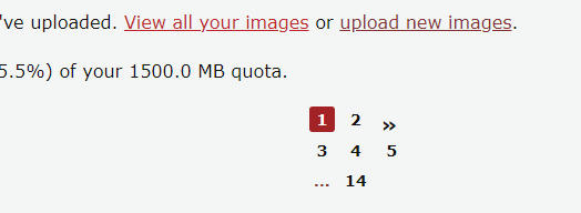
  • Pagination header/footer box formatting needs some adjustments (centering the numbers, for example)
  • Previewing comments was selecting 'other user' instead of 'logged in user'
  • The beta entry page does not preserve your icon selection when posting/editing an entry
sara: S (Default)

[personal profile] sara 2021-01-31 03:52 am (UTC)(link)
How hard am I laughing that Denise's contribution was ridding the site of 2020?

(no subject)

[personal profile] sara - 2021-01-31 04:02 (UTC) - Expand

(no subject)

[personal profile] sara - 2021-01-31 04:10 (UTC) - Expand

(no subject)

[personal profile] sara - 2021-01-31 04:13 (UTC) - Expand

(no subject)

[personal profile] sara - 2021-01-31 04:18 (UTC) - Expand

(no subject)

[personal profile] sara - 2021-01-31 05:07 (UTC) - Expand

(no subject)

[personal profile] assholic - 2021-01-31 04:25 (UTC) - Expand

(no subject)

[personal profile] kore - 2021-01-31 04:28 (UTC) - Expand

(no subject)

[personal profile] kore - 2021-01-31 04:32 (UTC) - Expand

(no subject)

[personal profile] kore - 2021-01-31 04:29 (UTC) - Expand
darjeeling: (Default)

[personal profile] darjeeling 2021-01-31 04:12 am (UTC)(link)
Did something in the page body identifier get changed? I'm applying a widescreen stylesheet via Stylus but it's stopped working.
momijizukamori: Grey tabby cat with paws on keyboard and mouse. The text reads 'code cat is on the job', lolcats-style (CODE CAT)

[personal profile] momijizukamori 2021-01-31 04:17 am (UTC)(link)
There were a couple of code tweaks to site-styles, which might have caused something - can you link the stylesheet? I can have a quick look.

(no subject)

[personal profile] darjeeling - 2021-01-31 04:23 (UTC) - Expand

(no subject)

[personal profile] momijizukamori - 2021-01-31 04:52 (UTC) - Expand

(no subject)

[personal profile] darjeeling - 2021-01-31 04:53 (UTC) - Expand

(no subject)

[personal profile] ignobel - 2021-01-31 06:03 (UTC) - Expand

(no subject)

[personal profile] darjeeling - 2021-01-31 06:34 (UTC) - Expand

(no subject)

[personal profile] ignobel - 2021-01-31 08:26 (UTC) - Expand

(no subject)

[personal profile] darjeeling - 2021-01-31 10:37 (UTC) - Expand
munaks: (Default)

[personal profile] munaks 2021-01-31 04:25 am (UTC)(link)
Seems like the default for responding to comments in the ?mode=reply page was changed from "Logged in account" to "Other Dreamwidth acount"? Not that big of a deal, but it can be awkward in the long run if the comment was posted anonymously instead.

(no subject)

[personal profile] munaks - 2021-01-31 04:45 (UTC) - Expand
fulgency: (Default)

[personal profile] fulgency 2021-01-31 04:28 am (UTC)(link)
Hey there, noticing that when I'm on the preview page, it doesn't default to the account I'm logged into. Included a screencap below to show what I mean.


A friend mentioned this is also happening on the More Options page. I use the preview page a lot to make sure I didn't bork HTML and such, so hoping this can be fixed!

(no subject)

[personal profile] fulgency - 2021-01-31 04:34 (UTC) - Expand
hipshoots: (Default)

[personal profile] hipshoots 2021-01-31 04:31 am (UTC)(link)
Hey, guys! Multiple pages look like this when I assume the numbers should be centered?

momijizukamori: Green icon with white text - 'I do believe in phosphorylation! I do!' with a string of DNA basepairs on the bottom (Default)

[personal profile] momijizukamori 2021-01-31 05:04 am (UTC)(link)
....yes. Yes they should.

(no subject)

[personal profile] hipshoots - 2021-02-01 00:36 (UTC) - Expand
a_shadow: (Default)

[personal profile] a_shadow 2021-01-31 04:35 am (UTC)(link)
Just reporting this in case it was a bug and not a random fluke. I logged into this account and made a comment, and when I submitted it made me fill out a captcha. I didn't think anything of it, and then after doing that, realized the comment had posted as anon.

(no subject)

[personal profile] a_shadow - 2021-01-31 04:46 (UTC) - Expand
kore: (Default)

[personal profile] kore 2021-01-31 04:37 am (UTC)(link)
Display all icons seems to have gone wonky:


I'm getting this on everyone's "View all uploaded icons" page, not sure if this is something with my style or the code push?
assholic: (Default)

[personal profile] assholic 2021-01-31 04:41 am (UTC)(link)
I feel like that's part of the problem with the fix they did for the bar/background (as I see you're also using tropispherical purple). The numbers aren't aligned properly on mass pages if you look at posts with multiple pages. (and I miss that darker purple).
espilan: (Default)

Now NOT accidentally as a response to someone else.

[personal profile] espilan 2021-01-31 04:39 am (UTC)(link)
I kinda get why it was done, but I am not a fan of the site-style comment pages getting narrowed by even more whitespace than before; obviously I can't speak for everyone, but I prefer using as much space as possible.
stromatolite: A paladin in full armor with her helmet in her hand. (paladin)

[personal profile] stromatolite 2021-01-31 04:41 am (UTC)(link)
The new page number display no longer allows me to see which pages I've already clicked on. This is a bit confusing.

kinetikatrue: (Default)

[personal profile] kinetikatrue 2021-01-31 05:33 am (UTC)(link)
+1

And at least for me, the numbers are smaller and less easily read than they were when they were the same size and boldness as e.g. the numbers in the 'number of comments' link? I'm using celerity, but from screenshots here, I can see that I'd have the same complaint about either tropo purple or red...
Edited 2021-01-31 05:40 (UTC)

(no subject)

[personal profile] ravenna - 2021-01-31 22:50 (UTC) - Expand
kamex: (folklore keats 2)

[personal profile] kamex 2021-01-31 05:01 am (UTC)(link)
For anyone who prefers the icon selector be 100x100 pixels, I've written up a quick fix.

.block-icon {
width: 100px !important;
height: 100px !important;
}
darjeeling: (Default)

[personal profile] darjeeling 2021-01-31 05:15 am (UTC)(link)
And

.block-icon-controls {
display: block;
align-items: center;
min-width: 0;
margin: 0.5em 0;
}


to fix the placement of the selector!
whomthebelltolls: (Than ever to listen to a word I said)

[personal profile] whomthebelltolls 2021-01-31 05:14 am (UTC)(link)
Heyo! Just a question: When I go to log in or out of a journal on my phone, instead of honoring the page I am currently on (usually when I'm in an entry page), it will instead load the first page of the journal/community the entry is part of. Then I usually have to back button + reload the page to get it to log me in on the entry I was originally looking at. It was doing it last code push, and it's still doing it this one - not sure if this is intentional?

Also just as a curiosity, is there a reason the entry/thread pages are fixed width instead of full width? I have a 2560x1440 monitor and it just leaves pretty much enough space for me to build a ranch and retire on.
roadrunnertwice: Industrial architecture and concrete bridge at sunset. (Portland - Lower Albina)

[personal profile] roadrunnertwice 2021-02-01 05:55 pm (UTC)(link)

Itโ€™s because most people start feeling strain/fatigue of some kind when the width of a single block of text exceeds some critical number of characters. Go too far past a hardback book pageโ€™s worth, and it gets dicey.

Some people are the opposite! Youโ€™re part of an elite few, and when we tune the width this way, it seems ugly and wasteful to you. But if we max it out, a bunch of other people will either lose the ability to read here or will straight-up hurl, so we gotta clamp it by default. Sorry. :/

(Yes, it should be configurable somehow. But the current transition is a prerequisite for making that even theoretically possible.)

(no subject)

[personal profile] roadrunnertwice - 2021-02-01 17:57 (UTC) - Expand

(no subject)

[personal profile] whomthebelltolls - 2021-02-01 18:16 (UTC) - Expand

(no subject)

[personal profile] roadrunnertwice - 2021-02-01 22:06 (UTC) - Expand

(no subject)

[personal profile] whomthebelltolls - 2021-02-01 22:40 (UTC) - Expand
atrypical: (Default)

[personal profile] atrypical 2021-01-31 05:57 am (UTC)(link)
This is mostly a problem on the old style (I see people have addressed the new style issues above) but when I look at a multipage post on the old style I get this.

(no subject)

[personal profile] assholic - 2021-02-01 00:46 (UTC) - Expand

(no subject)

[personal profile] atrypical - 2021-02-01 00:53 (UTC) - Expand

+1

[personal profile] bleedsdior - 2021-02-01 03:18 (UTC) - Expand

+1

[personal profile] landwaker - 2021-02-01 05:24 (UTC) - Expand
assholic: (Full body - 1)

[personal profile] assholic 2021-01-31 08:21 am (UTC)(link)
By the way, I love the icon selector window now and having the option for keywords organizing, but I'm curious if there's any way to make it remember your selection? It does with icon size and keywords showing, but not the actual organization itself.

No big deal if not. I like that it's an option now.
roadrunnertwice: Yehuda biking in the rain. (Bike - Rain (Yehuda Moon))

[personal profile] roadrunnertwice 2021-01-31 10:27 am (UTC)(link)

Uh, it's SUPPOSED to remember your selection. ๐Ÿ˜‘ I'll try and look into this later, thx for the heads-up. Is there any more info you can share about when it fails to remember?

edit: oh, never mind, I'm seeing it, it forgets as soon as you transition off the page. SIGH. I was pretty sure I had that licked before, but you know how it goes.

Edited 2021-01-31 10:28 (UTC)

(no subject)

[personal profile] assholic - 2021-01-31 10:33 (UTC) - Expand

(no subject)

[personal profile] assholic - 2021-02-01 00:39 (UTC) - Expand

(no subject)

[personal profile] roadrunnertwice - 2021-02-01 02:53 (UTC) - Expand

(no subject)

[personal profile] assholic - 2021-02-01 02:58 (UTC) - Expand
petzipellepingo: (Default)

[personal profile] petzipellepingo 2021-01-31 09:49 am (UTC)(link)
I've notified you twice about the fact that any replies to my posts are only showing up on this site and never at my e mail.
sporky_rat: A Dreamsheep dreaming of DW Support (_support)

[personal profile] sporky_rat 2021-01-31 02:59 pm (UTC)(link)

Notifications are an Eldritch Nightmare and are being worked on, but anything that doesn't make it to email is possibly being eaten by your email provider.

(no subject)

[personal profile] petzipellepingo - 2021-01-31 18:03 (UTC) - Expand

(no subject)

[personal profile] petzipellepingo - 2021-01-31 18:17 (UTC) - Expand
expain: (Default)

[personal profile] expain 2021-01-31 10:21 am (UTC)(link)
Question for an admittedly personal problem on my end as a primarily desktop user, since the fix for comments in widescreen posted up in one of the other threads worked for me, and everything else otherwise thanks to that fix seems to be fine now as well. But...


As the image says, is there any formatting in CSS that can allow me to visually go back from this to what I was using before, as far as entries/posts? The white space and forced-centering that causes it just irks me since I prefer the entry to fill up the page the same as the comments do (via comment fixes/user-codes/styles/etc) aka make the most of my monitor space as it's much easier for me to read that way, that's all. It popped up before I had Dreamwidth for Widescreen installed, then popped up again during the last big code push, which the user-contributed addendum to the style resolved for me, including comments/font/so on (the one here and in the main post from then). And now, since the current fix hasn't affected posts/entries like it did for seemingly everything else, I've tried tons of random ideas from Google aka thrown spaghetti codes to see if anything sticks, but I'm super CSS illiterate, honestly, so it's not really worked out for me (meaning if this is already being addressed in some way/has to do with any known issues, then my bad, I really can't recognize any of the terms that well).

Any help would be greatly appreciated!

P.S. Code for the widescreen style CSS I'm currently using with the new comment style fix applied that looks perfectly fine otherwise (not including the additional style sheets I use specifically/separately for inbox and font stuff as I don't think they're relevant and this is the main/base sheet and style I use for the entire site), if that matters:

darjeeling: (Default)

[personal profile] darjeeling 2021-01-31 12:13 pm (UTC)(link)
Oh, the fix above should have applied to the whole page, not just the comments but the post as well. Weird! Let me see if I can fix it.

(no subject)

[personal profile] darjeeling - 2021-01-31 13:05 (UTC) - Expand

(no subject)

[personal profile] runpunkrun - 2021-01-31 19:29 (UTC) - Expand

(no subject)

[personal profile] darjeeling - 2021-02-01 02:54 (UTC) - Expand

(no subject)

[personal profile] expain - 2021-01-31 22:20 (UTC) - Expand

(no subject)

[personal profile] darjeeling - 2021-02-01 02:54 (UTC) - Expand
ryototsukai: (Default)

[personal profile] ryototsukai 2021-01-31 03:26 pm (UTC)(link)
not sure if anyone's mentioned this, but for the sake of visual fidelity, there should probably be some way to indicate which pages you've already looked at on posts with multiple pages worth of comments to read through. that's my only real comment, since everything else that felt weird seems fine now!
betterworld: แฑฌ end game. โš (Default)

[personal profile] betterworld 2021-01-31 05:17 pm (UTC)(link)
I went to edit an entry just now and noticed that the icon I selected wasn't saved in the edit entry screen. I hit random and chose a different icon but when I viewed the recently edited page again, it had my old icon selected. So I repeated the process and sure enough, when I edit the entry it shows the default in the icon selector portion and when I hit random icon, it didn't save the newly selected icon in the post but rather has the one I selected when I first made the entry.

I hope that makes sense! I also hope it's not because I lack keywords; I don't typically bother with them on my rp accounts in case I want to swap out icons easily later on.

(no subject)

[personal profile] betterworld - 2021-02-01 01:02 (UTC) - Expand
divaricate: sways @ dw (age of ultron โ— 001)

[personal profile] divaricate 2021-01-31 06:47 pm (UTC)(link)
(Forgive the RP journal reply here.)

I've done some poking around here on mobile and desktop (Chrome browser in both cases, for what that's worth), and let me just gush about the icon browser for a sec because I love the new icon browser in comments! Not asking me to select/confirm the icon after I click on it is A+++ removal of what I thought was redundancy.

My only major questions are: Some of my tables still seem a bit wonky, especially in terms of spacing between lines and widths/heights cutting themselves off; I know tables got accidentally messed with in the last push (with a note in the post saying "< table >, < td >, and < div > tags unintentionally changed in styling -- looks like we're leaking the styling changes we made in the main scheme down. I think we can fix this -- please don't edit all your tables!"), and I'm wondering if that's still a work in progress or if I need to be tweaking my codes to adjust to this new standard?

And the second question that's less of an urgent problem but more of a 'hm, curious' moment: Since the last push, when I preview an entry before posting, the entry previews as how the entry looked before the last code push that changed the font sizes and such. So, the 12 point (?) font is still there, tables still look like they'll post all aligned, et cetera, but when I actually post the entry ... it doesn't look anything like the preview. The font size discrepancy isn't bothersome, but it is frustrating to think a table will post just fine and then when I actually post it, it's a mess. Which defeats the purpose of a preview and I'm wondering if this was also something that was just missed in the last push?
roadrunnertwice: Industrial architecture and concrete bridge at sunset. (Portland - Lower Albina)

[personal profile] roadrunnertwice 2021-02-08 06:18 pm (UTC)(link)

Tables

Tables are still kind of WIP, but also, if you're using tables to arrange things decoratively (as opposed to using them for tabular data), I think they're ALWAYS going to look wrong somewhere. Different browsers have different default styles for tables, journal styles will do different things when people see your post on their reading pages, etc. etc. So, I know they're easier/more familiar than some other things, but the price you pay is inconsistency and that's kind of just life.

Anyway, "best practices" aside, I'm gonna try and rip out all the framework default table styles in new-type entry pages and make them act like they used to, but I'm not sure what the best way to do that is, yet.

Preview

I had some confused back and forth about the preview in another thread, but I think we figured it out. Long story short:

  • There's new/old versions of the create entries form, AND new/old versions of the comment pages.
  • If you use new+new or old+old, preview is fine; if you mismatch them, preview is wrong.
  • The default state, if you don't change the beta settings at all, is to use the old create entries page and the new comment pages, just because one of them is closer to "done" than the other. Which results in a goofy preview, unfortunately.

So if you don't use the rich text editor, you can enable the beta create entries page and get good preview. We're working on it. :/

Edited 2021-02-08 18:19 (UTC)
peaked: CINDY. (Default)

[personal profile] peaked 2021-01-31 08:08 pm (UTC)(link)
I had a look at the code tour and will admit I am not a coder at all, so apologies if this was captured in one of the items listed and I missed it when doing my fancy ctrl+f search.

Was the "Load All" feature at the bottom of an entry that had multiple pages removed during this code push? It was such a neat feature I used all the time. (It enabled my laziness.)
azurelunatic: Vivid pink Alaskan wild rose. (Default)

[personal profile] azurelunatic 2021-01-31 10:56 pm (UTC)(link)
That sounds like a feature from an extension; it's possible that this code push changed something that the extension depended on.

(no subject)

[personal profile] peaked - 2021-01-31 23:03 (UTC) - Expand

(no subject)

[personal profile] ilyena_sylph - 2021-02-01 00:57 (UTC) - Expand

(no subject)

[personal profile] peaked - 2021-02-01 01:21 (UTC) - Expand
aescapes: (Default)

[personal profile] aescapes 2021-01-31 11:52 pm (UTC)(link)
hi devs! thank you for your hard work on this site!

these are the issues i have with navigation, and they are semi-related:

the first issue started with the last code push in july 2020, and i was hoping this next small tweak push it would be fixed. since it's not, here it is - hyperlink "history/visited" decorations have been removed from journal and community names, whether you are viewing them on comment pages or profiles. this means you can't tell which journal pages you've visited/clicked on.

tangentially related, with this new push, the updated style of the numbers comment pages above and below each multi-page comment section likewise make it impossible to tell which pages you've already visited.

both of these broken/altered click decorations make it hard to keep up with pages, topics, and individuals you are engaging with or have already engaged with in discussion.

hoping these things can be fixed soon! thank you again!

(no subject)

[personal profile] aescapes - 2021-02-01 01:09 (UTC) - Expand

(no subject)

[personal profile] roadrunnertwice - 2021-02-01 03:27 (UTC) - Expand
picterman: (Default)

[personal profile] picterman 2021-02-01 08:20 am (UTC)(link)
window "Rich text" not work.

https://ibb.co/jb6qHT5
runpunkrun: portion of koch snowflake fractal, text: snow fractal (Default)

page navigation on image pages

[personal profile] runpunkrun 2021-02-01 04:10 pm (UTC)(link)

Not sure if this is a recent development, but the page navigation menu looks weird on the image upload, display, and edit pages:

screenshot of a kind of janky-looking page navigation menu

The ยป isn't where I'd expect it to be, and it gets even weirder on higher pages where the arrows still surround the 1. Plus the "..." is highlighted when I mouse over it but clicking on it does nothing where I'd expect it to expand to give me clickable links to the rest of the pages. It's this way in Firefox and Chrome.

Personally, I'd like those page links more linear (not so much in a square) and more plentiful--I don't want to have to arrow my way to page ten.

dancing_serpent: (Default)

[personal profile] dancing_serpent 2021-02-01 04:23 pm (UTC)(link)
I've been getting a lot of new subscriptions from older/empty accounts within the past 48 hours, sometimes within a span of minutes (on this one and on my site journals). Looks like accounts have been hacked again? Where should I report them?
teenyoda: (Default)

[personal profile] teenyoda 2021-02-04 03:46 pm (UTC)(link)
Hey. I don't know what's goofing up here, but this is the first time I've seen this problem show up and I went back and turned the beta testing off and on and it seems that if I turn beta testing ON, to put it back to the 'old' method, the font on the code there is #ebebeb (a whitish shade). Turning it off and going to what you've updated the code, it's incredibly dark and unreadable. Changing the font shade doesn't seem to help. I'm guessing this has something to do with the code (which is available in the comments) and I'm happy to tweak it myself but... I don't know what to tweak. Could you point me at what part of the code's borked? Or why it's the new code push that borked it?

Linking it would probably help, sorry.
Edited 2021-02-04 15:47 (UTC)
roadrunnertwice: Parking lot stencil: "ALL TREES WILL BE TOWED," with tree glyph in "no" sign. (All trees will be towed)

[personal profile] roadrunnertwice 2021-02-05 08:05 pm (UTC)(link)

Mmf. So: your inner elements are inheriting their color from a parent element. In the old skins, they get it from the surrounding <table> element, but in the new ones it gets overridden by a default style on <td> elements, so they get it from there instead.

So here's the answer I WANT to give you: <table> elements are meant for tabular data, and if you use them to just lay out arbitrary stuff, it's ALWAYS going to break SOMEWHERE. Different journal styles have different default styles for tables, other sites have different default styles for tables... using a table ultimately just makes more work for yourself unless you're 100% certain that it only needs to look right in exactly ONE environment. So you should use plain <div>s and handle the box layout with flexbox or grid properties.

But, also I know everyone still loves misusing tables for layout, and I can't stop them, and probably we should try and preserve expectations about how tables act in journal content. I think we can maybe try to rein in those new default table styles and keep them out of journal content entirely, but it might take a few tries. We'll see.

Anyway, I encourage you to learn how to get what you want from plain divs and CSS grid! It's a cool skill to have, and will serve you well elsewhere. But if you're in a hurry you can probably just throw a style="color: #fff" attribute onto those <td> tags.

(no subject)

[personal profile] teenyoda - 2021-02-05 20:14 (UTC) - Expand

(no subject)

[personal profile] roadrunnertwice - 2021-02-05 23:02 (UTC) - Expand

(no subject)

[personal profile] teenyoda - 2021-02-05 23:08 (UTC) - Expand

(no subject)

[personal profile] roadrunnertwice - 2021-02-05 23:13 (UTC) - Expand

(no subject)

[personal profile] teenyoda - 2021-02-05 23:18 (UTC) - Expand

(no subject)

[personal profile] roadrunnertwice - 2021-02-08 17:49 (UTC) - Expand

(no subject)

[personal profile] teenyoda - 2021-02-08 18:43 (UTC) - Expand

(no subject)

[personal profile] roadrunnertwice - 2021-02-08 20:17 (UTC) - Expand

(no subject)

[personal profile] teenyoda - 2021-02-08 20:20 (UTC) - Expand
restoredhonor: (Default)

[personal profile] restoredhonor 2021-02-04 10:36 pm (UTC)(link)
Icons have disappeared! Like, the keywords are still there, but I can't see any of the icons.
roadrunnertwice: Wrecked bicyclist. Dialogue: "I am fucking broken." (Bike - Fucking broken (Never as Bad))

[personal profile] roadrunnertwice 2021-02-05 07:44 pm (UTC)(link)

Thank you for reporting! I found a clue to what the problem was, raised it to [staff profile] mark, and he fixed it. If you refresh, hopefully things should be fine again (might need to clear your cache, though).

Page 1 of 2