mark: A photo of Mark kneeling on top of the Taal Volcano in the Philippines. It was a long hike. (Default)
Mark Smith ([staff profile] mark) wrote in [site community profile] dw_maintenance2019-06-22 08:10 pm

Code push has happened!

Hi all, I'm preparing to do a code push. You can see the latest code tour here: https://dw-dev.dreamwidth.org/214638.html

Hang on to your hats!

Edit: The code has pushed! As always, please let us know if you see anything wonky or broken and we'll get on it!

Known Issues - Fixed 'em Maybe?


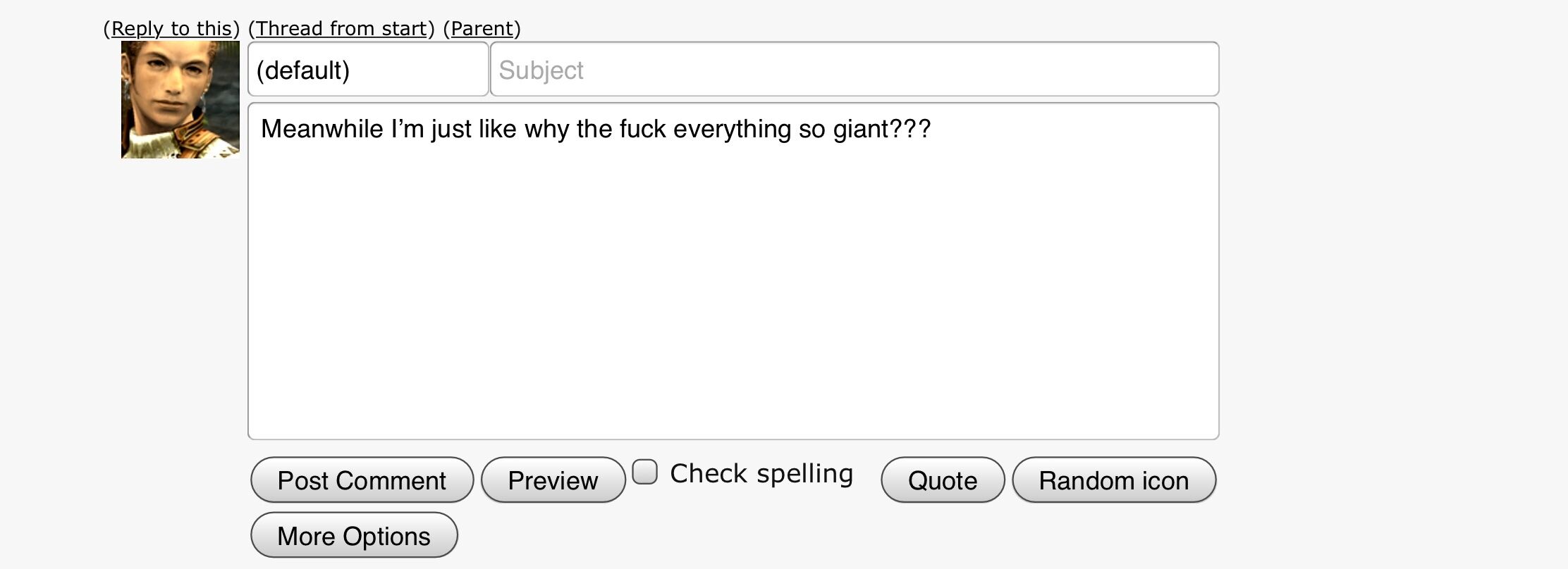
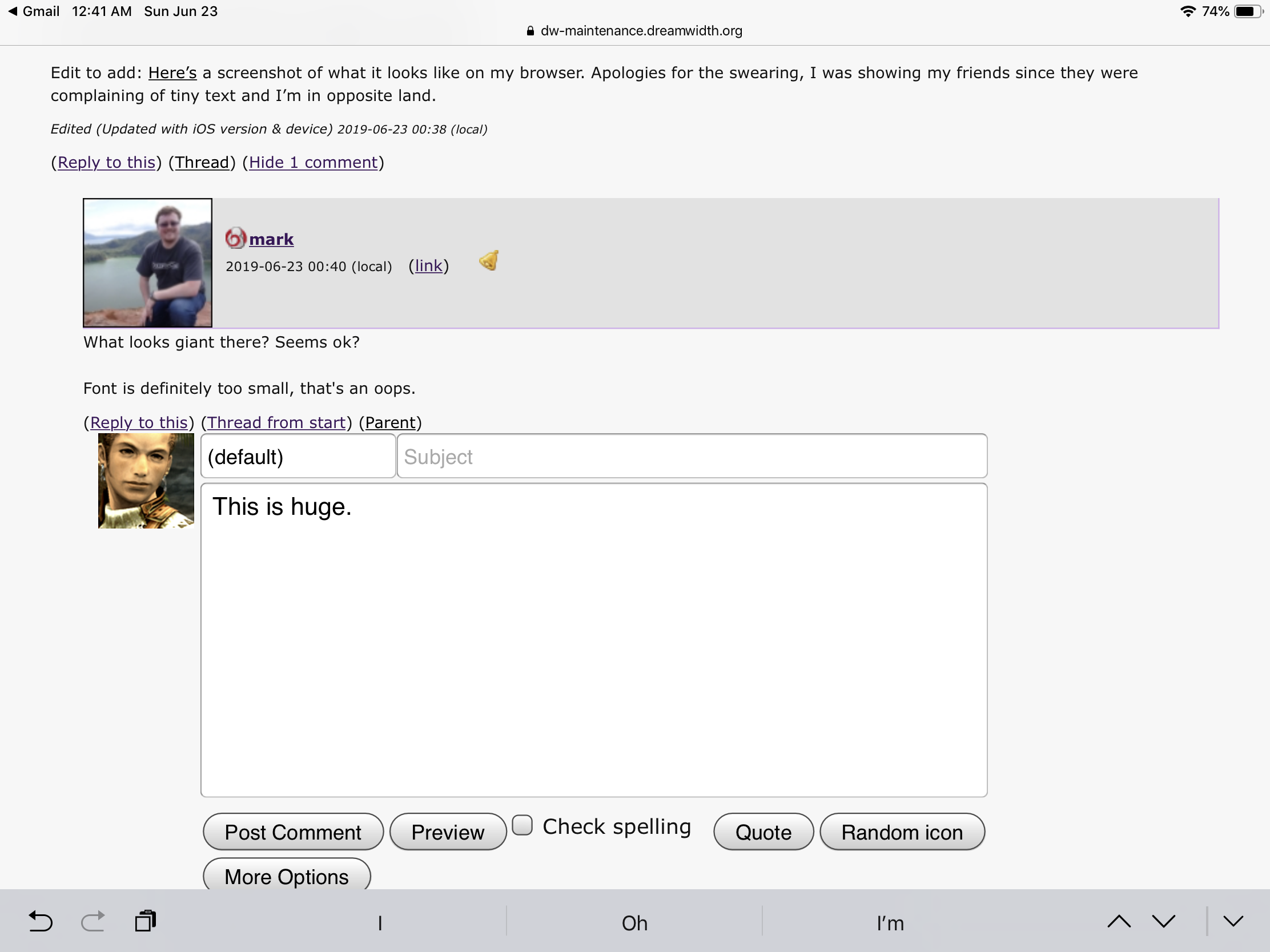
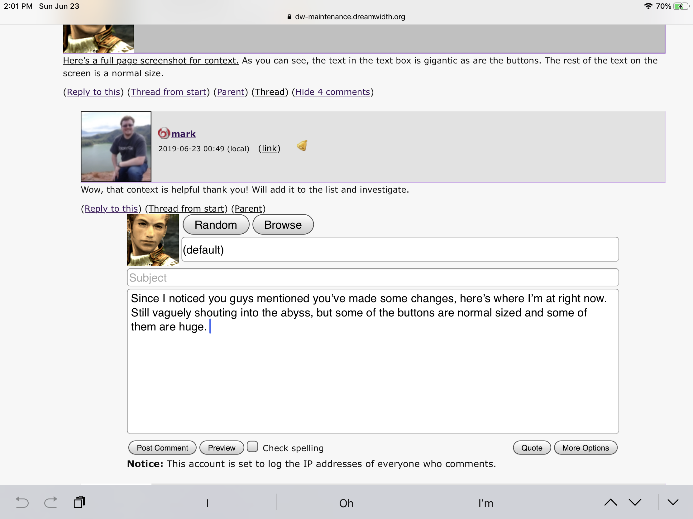
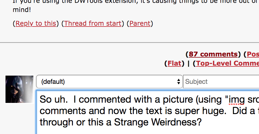
* Font size was way too small. We've tweaked them to be larger, but would welcome more feedback!
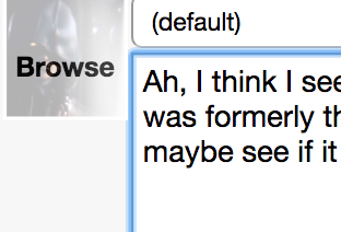
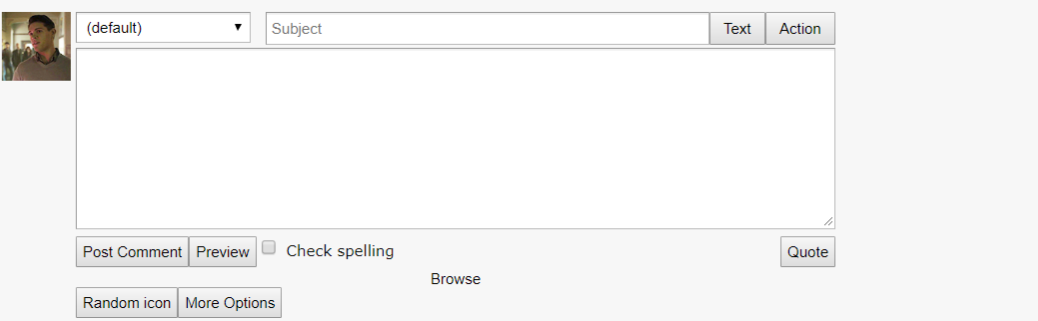
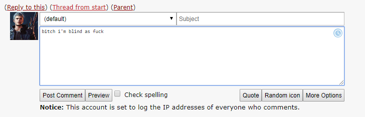
* Lack of ability to horizontally resize comment area. This has been fixed, you can drag the box horizontally again like you should be able to!
* A couple of style issues have been found and fixed.
* An issue affecting some Navigation strips has been fixed.
* An issue affecting syndicated accounts, proxied images, and a couple other worker related tasks were broken. They're better now.
* We've made some updates to the design of the comment reply form, we brought back the browse button, made the subject line full-width, and some other tweaks. Please let us know what you think!
* The RTE on the old create entry form is returned to service. A few more months, that's all we ask of you old friend...
* OpenID was broken, it's back.
* Button sizes are reset to default, we are no longer trying to make things line up. Let the ziggurat design pattern live on.
* Polls should show properly sized bars again.
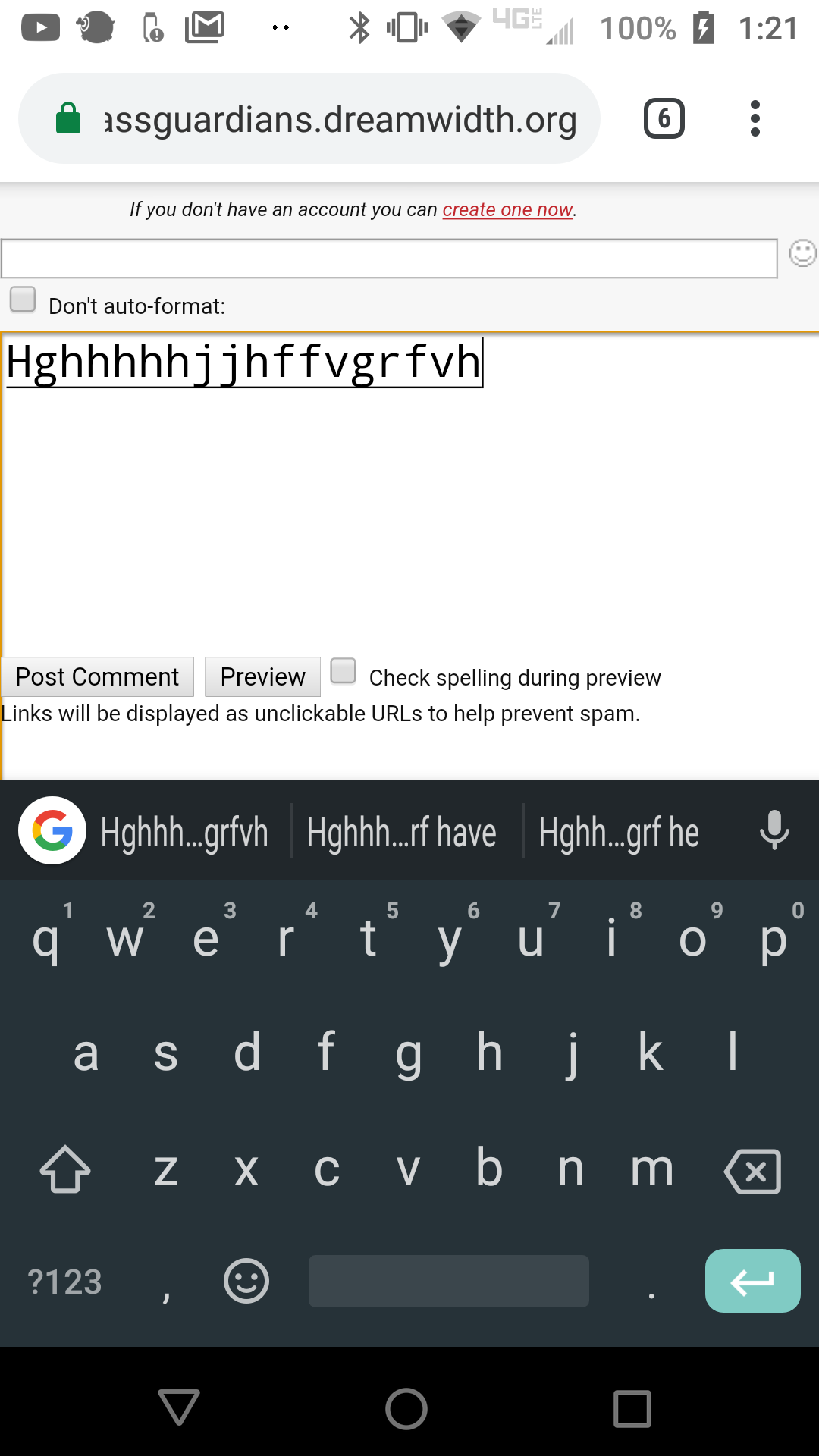
* Lots more Android issues, we had to murder the unused spellcheck button to make it work out. Some weird interactions with differently sized elements and our ancient HTML.

Known Issues - Pending


* Related, some fields seem to have gone emo and are putting on heavy eyeliner (have bold, dark outlines). We're aware.

All known issues are being investigated and will be fixed! Please hang tight while we work on it :)

If you are reporting something visual, please let us know what browser/device you're on!

ayebydan: (misc: huge on the internet)

[personal profile] ayebydan 2019-06-23 03:22 am (UTC)(link)
As ever, thank you so much for the detail and the advanced warning :)
brooksmoses: (Default)

[personal profile] brooksmoses 2019-06-23 03:36 am (UTC)(link)
Yay, code pushing! Hat duly hung on to. :)
camobscura: (Default)

[personal profile] camobscura 2019-06-23 03:56 am (UTC)(link)
Rich text won't come up when I try to post now -- html option only. Running Safari, if that means anything...
zarahjoyce: (Default)

[personal profile] zarahjoyce 2019-06-23 06:29 am (UTC)(link)
This is also my problem! I'm using Google Chrome.
tiresome_cat: (Default)

[personal profile] tiresome_cat 2019-06-23 07:06 am (UTC)(link)
Have same problem too. FF 51.0.1 32-bit and latest version of Google Chrome 64-bit.
suhajh: (Default)

[personal profile] suhajh 2019-06-23 11:52 am (UTC)(link)
Have same problem too. Edge 64-bit
caprbb_mod: shield with white border (Default)

[personal profile] caprbb_mod 2019-06-23 08:10 am (UTC)(link)
Glad to know I'm not alone!

[personal profile] umanothing 2019-06-23 10:00 am (UTC)(link)
i have the same problem, and i've tried on Chrome, Safari and Firefox.
sparowe: (See)

[personal profile] sparowe 2019-06-23 11:00 am (UTC)(link)
Same, though Chrome. I'm sorry I didn't see your comment before adding my own!
kaberett: Trans symbol with Swiss Army knife tools at other positions around the central circle. (Default)

[personal profile] kaberett 2019-06-23 11:54 am (UTC)(link)
I've flagged this up to staff specifically! I don't have a good idea of what might be causing it but as and when folk with more coding experience than me wake up we'll be on it. :)
wolfy_writing: (Default)

[personal profile] wolfy_writing 2019-06-23 12:32 pm (UTC)(link)
I'm having the same problem, on Safari
cmcmck: (Default)

[personal profile] cmcmck 2019-06-23 12:40 pm (UTC)(link)
Also a problem here running via google chrome.
silveredeye: anime-style person with long light hair (Default)

[personal profile] silveredeye 2019-06-23 01:20 pm (UTC)(link)
I'm having the same problem on Firefox 67.

If it's any help to those investigating, in the browser console I see the following warnings:
"The script from “https://www.dreamwidth.org/stc/??fck/fckeditor.js?v=1561260639” was loaded even though its MIME type (“text/html”) is not a valid JavaScript MIME type.
Loading failed for the with source “https://www.dreamwidth.org/stc/??fck/fckeditor.js?v=1561260639”.""

and then an error "ReferenceError: FCKeditor is not defined".
Edited (clarification) 2019-06-23 13:20 (UTC)
kaberett: Trans symbol with Swiss Army knife tools at other positions around the central circle. (Default)

[personal profile] kaberett 2019-06-23 01:24 pm (UTC)(link)

Thanks for doing this investigation! I've stuck this comment in my masterlist of things to make Mark's problem once he wakes back up. :)

fireofuniverse: jerrica benton pilot (jerrica)

[personal profile] fireofuniverse 2019-06-23 02:40 pm (UTC)(link)
The same problem at latest version of Firefox. I thought it's because of browser update. Hope everything will be okay soon :)
hyperverbose: (Tᴏ sᴄᴏʀᴇ ᴀ ᴛᴇɴ ᴡᴏᴜʟᴅ ʙᴇ ᴊᴜsᴛ ғɪɴᴇ)

[personal profile] hyperverbose 2019-06-23 03:04 pm (UTC)(link)
Oh god me too. Google Chrome. 8((((((((((
tehexile: (Default)

[personal profile] tehexile 2019-06-23 05:08 pm (UTC)(link)
same problem here, with Chrome
badly_knitted: (JB Weird)

[personal profile] badly_knitted 2019-06-23 05:15 pm (UTC)(link)
Same here, also with Chrome.
denise: Image: Me, facing away from camera, on top of the Castel Sant'Angelo in Rome (Default)

[staff profile] denise 2019-06-23 05:21 pm (UTC)(link)
Thanks everyone for the reports, we'll try to have that fixed today!
badly_knitted: (Default)

[personal profile] badly_knitted 2019-06-24 10:52 am (UTC)(link)
Working for me now, at least for editing existing posts... And it's accssible for new posts too. Thanks for the quick action!
borntolove: (Broken)

[personal profile] borntolove 2019-06-23 04:01 am (UTC)(link)
No pop up menu in Chrome to browse icons
brokenallthelaws: (Default)

[personal profile] brokenallthelaws 2019-06-23 04:07 am (UTC)(link)
If you click on the picture of your default to the side of the text entry field it should pop up. It did for me, anyway.
brokenallthelaws: (Ω and bam there's your man)

[personal profile] brokenallthelaws 2019-06-23 04:09 am (UTC)(link)
No prob. o7
voiceoftruth: (Default)

[personal profile] voiceoftruth 2019-06-23 04:48 am (UTC)(link)
That is definitely not happening for me when I click the picture.
letxequalnull: (Default)

[personal profile] letxequalnull 2019-06-23 04:52 am (UTC)(link)
Ah, I think I see (some of) the problem? It looks like you've got a basic account and what was formerly the browse icon doesn't work on those. If you have a paid somewhere, maybe see if it works there? Here's what it looks like on my end if I hover that icon:

Edited (shrinking the pic down) 2019-06-23 04:54 (UTC)
vivifier: (Default)

[personal profile] vivifier 2019-06-23 04:55 am (UTC)(link)
It still seems off on paid account. Someone said because I used DW tools, but that seems...weird?
letxequalnull: (Default)

[personal profile] letxequalnull 2019-06-23 04:57 am (UTC)(link)
Could be? I don't have DW tools installed so I can't speak to that.
vivifier: (Default)

[personal profile] vivifier 2019-06-23 04:58 am (UTC)(link)
I turned it off, and it's still doing it so /shrugs/
criminaljustice: (039)

[personal profile] criminaljustice 2019-06-23 05:15 am (UTC)(link)
I have both Premium account and no DW Tools and it's not opening for me either. I'm on a Chromebook, tho. Not sure if that's a factor.
devilarmory: (Default)

[personal profile] devilarmory 2019-06-23 04:03 am (UTC)(link)
Thank you so much for all your hard work! Forgive me for asking, but is there a way to revert to the old comment posting form? The new one is very small on my browser and really difficult to read what I'm actually writing.
momentarily: (Default)

+1

[personal profile] momentarily 2019-06-23 04:07 am (UTC)(link)
I would like the option to revert back. The new comment box is very small and hard for me to see, and without the browsing option I can't see the icons I'm choosing very well either.
brokenallthelaws: (Default)

Re: +1

[personal profile] brokenallthelaws 2019-06-23 04:11 am (UTC)(link)
On chrome at least, clicking the icon picture to the left of the comment box pulls up the browse option.
etoilesmortant: (Default)

Re: +1

[personal profile] etoilesmortant 2019-06-23 04:11 am (UTC)(link)
Your browse button is now the icon next to your comment. Not very intuitive tho.
wordsinthesoul: (Default)

Re: +1

[personal profile] wordsinthesoul 2019-06-23 04:32 am (UTC)(link)
The word does pop up when I hovered over the icon, but it wasn't my first thought, yeah.
drammaturga: (Default)

[personal profile] drammaturga 2019-06-23 04:09 am (UTC)(link)
+1

If it were a bit bigger, this would be a lot better. On Chrome, btw.
Edited 2019-06-23 04:19 (UTC)
brokenallthelaws: (Default)

+1

[personal profile] brokenallthelaws 2019-06-23 04:10 am (UTC)(link)
Agreed. The text is a little small on my screen (if not so much so as to be a major problem), but I know a couple of people for whom small text is/can be a migraine trigger and I'm not sure how well this scales.
misheard: (Xander)

[personal profile] misheard 2019-06-23 04:10 am (UTC)(link)
+1

The text is tiny and hurts my eyes.
morganknight: (Default)

[personal profile] morganknight 2019-06-23 04:11 am (UTC)(link)
Yeah, the text is absolutely teeny.

+1

[personal profile] confiscated 2019-06-23 04:11 am (UTC)(link)
I have a lot of trouble reading the text (typed in the comment box) as it shows up about 6-8pt in Chrome. I also preferred the other way of arrangement and am not quite sure what warranted this change.
Edited (edited to specify) 2019-06-23 04:11 (UTC)
etoilesmortant: (diego)

+1

[personal profile] etoilesmortant 2019-06-23 04:12 am (UTC)(link)
If I was typing at a normal size, I wouldn't really care about the overall change to the format.
pauamma: Cartooney crab wearing hot pink and acid green facemask holding drink with straw (Default)

[personal profile] pauamma 2019-06-23 04:13 am (UTC)(link)
Indeed, quickreply does look smaller than it used to be for me as well. Chromium Version 73.0.3683.103 (Official Build) (64-bit), Style: Basic for Transmogrified by Yvonne
pauamma: Cartooney crab wearing hot pink and acid green facemask holding drink with straw (Default)

[personal profile] pauamma 2019-06-23 04:46 am (UTC)(link)
It looks a teeny bit larger, but I'd prefer (like, it looks like, many others) the previous size for both the text and the box itself.
archangelbeth: An egyptian-inspired eye, centered between feathered wings. (Default)

subject text is teenytiny

[personal profile] archangelbeth 2019-06-24 04:05 am (UTC)(link)
Not pauamma, but body text is better for me! (Subject text is minuscule and, weirdly, does not seem to be responding to command-plus or command-minus?? So it's the same tiny text in that field even though cranking up the text on the rest of the page seems to be affecting body-text as I would expect.)

ROUNDED RECTANGLES AT THE BOTTOM! Yay! ...but "random" and "browse" at the top are still square. *emoji with ? expression*

...random/browse buttons up by my icon are crowding the "reply to this" etc. options for what I'm replying to. So is my icon; can there be a few pixels between it and the "(Reply to this)" command link?

Edit: Still on a very old Mac, using up-to-date Firefox. ...in the "Post a comment in response" page here, that I have for this edit, the subject text is STILL teeny-tiny, and it's a different font from the Courier that's in the body text. (I like Courier in the body text. Please don't break it. >_> )
Edited 2019-06-24 04:07 (UTC)
roadrunnertwice: Hagrid on his motorcycle, from Harry Potter and the Sorceror's Stone. (Motorcycle (Hagrid))

Re: subject text is teenytiny

[personal profile] roadrunnertwice 2019-06-24 09:49 pm (UTC)(link)
Hey,

So you’re saying the subject text for the big sprawly comment form is ALSO tiny? I’m not sure what you’re seeing then, because I don’t think we changed the fonts in that one at ALL!

In both forms, the current fonts for form fields should be your browser’s defaults; the only exceptions are touch-based devices, where we make it bigger. For small text fields like subject, most browsers default to a sans-serif font instead of the monospace that gets used in big textareas.

Can you post a screenshot or something?
archangelbeth: An egyptian-inspired eye, centered between feathered wings. (Default)

Re: subject text is teenytiny

[personal profile] archangelbeth 2019-06-25 12:49 am (UTC)(link)
The subject line has teeny tiny text in it. Honestly, the screenshot doesn't do justice to the size difference. Maybe I shoulda kept the phone back at my eye level. (oops. ^_^ )

The weird part is that while the bodytext (the thing I'm typing right this moment) will change size, as expected, when I crank up the overall magnification... The subject line's text doesn't change size appreciably.


Again, old Mac, current version of Firefox.
denise: Image: Me, facing away from camera, on top of the Castel Sant'Angelo in Rome (Default)

Re: subject text is teenytiny

[staff profile] denise 2019-06-25 07:50 pm (UTC)(link)
Hmmm. We didn't change the font in there at all! Inside the textarea for the body of the subject, yes, but none of the changes should have even touched the subject entry box at all. So we're kind of stumped!

With the careful disclaimer that I TOTALLY GET how "tiny" and "huge" are subjective perceptions of text size that have many factors going into them and thus what is small to one person may be huge to another all taken for granted, and I'm not trying to invalidate your perception in the least, I promise: I don't perceive the font in the subject textbox to be substantially different than it was before either on my journal (also using Celerity / Mac / Firefox) or in the screenshot. (For the record, my eyes are also terrible and I'm also using larger fonts in my browser!) I almost wonder if it's that the Courier is reading to your eyes as larger, since monospace fonts always read larger at the same size, and that makes the sans-serif read smaller when it's put right next to the monospace?

My other suggestion is to maybe reset the in-browser magnification to the baseline at 100%, then change your font defaults in your browser settings to be at a readable font size for you, then restart your browser and see if that helps at all. I *think* Firefox doesn't apply in-browser magnification to text areas 100% consistently, which may be causing issues. But that's kind of just spitballing, sorry :/
archangelbeth: An egyptian-inspired eye, centered between feathered wings. (Default)

Re: subject text is teenytiny

[personal profile] archangelbeth 2019-06-28 01:12 am (UTC)(link)
Lemme try that! (It actually worked without a browser restart! I just had to reload the page once.)

Okay, some may indeed be that there's a comparison, but the subject line's font size is not scaling with magnification, while the Courier (body-text) is. And it's definitely a problem when I'm having a bad eye day.

I have changed Firefox preferences to... There we go. Minimum size 14, and do NOT allow pages to override my preferences. (This page, I think, was overriding my preferences.) Subject line's font size still does not scale when I magnify via command-plus, nor does it shrink likewise. (Got down to 67% and I still have what I assume is Helvetica 14 point in the subject line, even though the Courier has gone down to something smaller.)

I dunno if you want to pursue the subject-line text not obeying Firefox magnify/shrink, since my problem is solved, or just file it as Known Weirdness. *grin*

Thanks for reminding me that Firefox has font-size preferences that can be independent of system preferences! -_-

...I'll restart the browser, just in case, and edit this if it behaves any differently.

Edit: no changes; Subject line's font size laughs at magnify/shrink commands, even as the rest of the page behaves reasonably. *shrug emoji*
Edited 2019-06-28 01:13 (UTC)
denise: Image: Me, facing away from camera, on top of the Castel Sant'Angelo in Rome (Default)

Re: subject text is teenytiny

[staff profile] denise 2019-06-28 01:21 am (UTC)(link)

Yeah, I think that's a case of Firefox not properly applying on-the-fly resizing inside text areas. I don't think there's anything we can do with that, I'm sorry :(

archangelbeth: An egyptian-inspired eye, centered between feathered wings. (Default)

Re: subject text is teenytiny

[personal profile] archangelbeth 2019-06-28 01:38 am (UTC)(link)
No worries! Now that I have forced it to be adequate by default, it's not my problem anymore. (It's just weird, since it did resize the body-text thing, pretty sure. May not be doing that now that I've untickied the "allow page to override" option. Hm.)

But if anyone else has the problem, at least you can point to this thread! O:>
fataler: (Default)

+1

[personal profile] fataler 2019-06-23 04:13 am (UTC)(link)
I am really struggling to read the smaller text as well.
axiometric: (At Ease)

[personal profile] axiometric 2019-06-23 04:15 am (UTC)(link)
+1

Honestly the text is too small. I'm overall fine with some of the changes but I have a bit of trouble seeing thanks to the font size
synchroswim: (pic#13095336)

[personal profile] synchroswim 2019-06-23 04:15 am (UTC)(link)
seconding what everyone else has been saying; It's a bit of a struggle to see and ctrl + makes everything else a tad too big!
skulltaffy: ❝⚓ ⚙✿♥♠◆♣♪♫🎶✖,⋎⋏✓⚡☼☂☁☠☢❖℧Ω❞ (Default)

+1

[personal profile] skulltaffy 2019-06-23 04:16 am (UTC)(link)
Chiming in to add my support to at least have a larger text size option.

The overall layout doesn't bug me, but I'm, to put it colloquially, blind as fuck, so the smaller text is screwing me up. The rest is very sleek though!!

ETA: I'm on Chrome, for reference. I've heard it's not so bad on Firefox/etc, so maybe it's a bug?
Edited 2019-06-23 04:20 (UTC)
kamex: (saga frontier riki art)

+1

[personal profile] kamex 2019-06-23 04:21 am (UTC)(link)
It's almost unreadably small, I have to zoom in on firefox to be able to read what I'm typing.
helborn: (Default)

+1

[personal profile] helborn 2019-06-23 04:22 am (UTC)(link)
Agreed. I personally have some vision problems and it's hard to see stuff like this.
devilarmory: (i can't seem to control)

[personal profile] devilarmory 2019-06-23 04:23 am (UTC)(link)
Right, should've specified--I'm on Chrome as well and I'm looking at this basically.
kamex: (vagrant story ashley and callo art)

[personal profile] kamex 2019-06-23 04:27 am (UTC)(link)
Can confirm that it's the same on firefox. Bumping it up a couple of font sizes would drastically improve accessibility.

Edit: somehow on my end that image suddenly looks blown up? thanks imgur
Edited 2019-06-23 04:28 (UTC)

[personal profile] confiscated 2019-06-23 04:31 am (UTC)(link)
Can you perhaps add a button for browsing icons vs clicking the icon itself? I don't mind it being there but I find it's unintuitive to have to click it to get that pop up when "random icon" is also still its own button.

Similarly, the issue with not being able to horizontally adjust the text area box past its set width - is that intended?
brokenallthelaws: (Default)

[personal profile] brokenallthelaws 2019-06-23 04:35 am (UTC)(link)
Yeah, +1-ing to the button for icon browsing. If I hadn't hovered the icon next to the comment box, I wouldn't have known to look there, and I'm seeing I'm not the only person having a "where is the browse" problem.
forgottenmercy: (Default)

[personal profile] forgottenmercy 2019-06-23 04:36 am (UTC)(link)
yet another +1 on the browse button
flurface: ♥️ (Default)

[personal profile] flurface 2019-06-23 04:37 am (UTC)(link)
+1 to the hoping that not being able to horizontally adjust the text area box is not intended, since I liked being able to do that.

[personal profile] confiscated 2019-06-23 04:57 am (UTC)(link)
I already see the size change, which is great! Thanks!

I know you guys are busy but just a few more suggestions:
- No zoom on the icon (it doesn't suit the slick look,) but a browse button under it or even a small text "browse" to launch the icon browser for those who are having hover issues, etc.
- Maybe move subject to it's line above or below (icon dropdown)? That way you could add browsing + random icon + quote to that line (below or above subject) for a crisper look. Having an icon choice to the left, to the top and to the bottom right is kinda messy.

Example:
(Icon dropdown) (random icon) (quote)
(full line for just comment header)
(text area)
(post comment / preview) (more options)
The old browser had it similar to that but with the header first, icon options second, then the text area. The eye doesn't really follow the current set up smoothly. Sry if this just sounds like complaining but I'm just having trouble adjusting and see others are too!

EDIT: Now the text in the comment boxes is a size too large? I'm on Chrome / Windows. It was fine when I posted this initial comment and is now flakey. But I'm gonna let you guys work on that as you will.
Edited 2019-06-23 05:02 (UTC)
toil: (Default)

[personal profile] toil 2019-06-23 05:02 am (UTC)(link)
hi, i'm so sorry, i know you're trying to help the original "too small" problem - you did, at first, but then another size change happened, and now the font inside the comment box is incredibly large. too big for comfort for a lot of us doing some testing.

can anything be done to go back a step?
toil: (Default)

[personal profile] toil 2019-06-23 05:21 am (UTC)(link)
ok as an update from my testing friends, the coding seems to affect different monitor sizes and screen resolutions differently, as it pertains to font size, comment box size, and i think even button size.

the font size inside the comment box is great for a lot of us now, for example, but for those with 16/17 inch screens and wider, it shrinks in relativity.

on mobile apps of the same browsers these users are using, it doesn't necessarily behave the same way - mobile chrome users report gigantic font appearance, so there may be another line of code that still needs implementing to mimic what you've done for PC/mac chrome.

just wanted to offer that to you guys for review purposes!
gairuki: (my best friend)

[personal profile] gairuki 2019-06-23 05:35 am (UTC)(link)
I'm one of the code testing friends with a widescreen 17in monitor, and as of this posting on my laptop the text is better for me in the box! It's not tiny or huge. I don't normally post from mobile however, and when someone told me about some issues there I thought I'd take a poke and just...

link is it supposed to be this huge? If so then fantastic! If not, I thought you'd like to know. (that's taken from a Motorola Moto Z2 Play Android in Mobile Chrome).
Edited (changed image to a link) 2019-06-23 05:35 (UTC)
criminaljustice: (268)

[personal profile] criminaljustice 2019-06-23 05:12 am (UTC)(link)
+1ing the icon browsing. especially the point that there's a "random icon" button which is likely used far less frequently.

Also clicking on the icon doesn't seem to work for people who don't have default icons and i... i dislike. please. let me live.
crossmyheartandhope: (Just shine a light into the wreckage)

[personal profile] crossmyheartandhope 2019-06-23 06:04 am (UTC)(link)
+1, I would love a browse button. I tend not to use default icons, so it looks like that means I'm not able to click the icon to browse? Which is somewhat inconvenient.
Edited 2019-06-23 06:04 (UTC)
clairvoyance: I've already forgotten yesterday's dream (Default)

[personal profile] clairvoyance 2019-06-23 06:25 pm (UTC)(link)
Would it be possible to at least leave the old style when the user clicks "more options"? That's how it is now, and I think it would be appreciated by a lot of people if the old style was accessible in that way. It's tried and tried and works for older computers and tons of browsers and configurations. I know I'll be very disappointed if it goes away entirely.
denise: Image: Me, facing away from camera, on top of the Castel Sant'Angelo in Rome (Default)

[staff profile] denise 2019-06-23 06:29 pm (UTC)(link)
The reason that we're making changes is because the old views weren't good enough for a ton of people! (They seriously weren't, "this doesn't work on my phone" is the #1 issue people contact us about right now.) So, no, we won't keep the old comment form, because it's never good to have multiple versions (and part of this is combining all the various comment forms, because there are multiple code paths depending on what view you're looking at and that's part of the problem). But we will fix the bugs that people find.
antiquity: (Default)

+1

[personal profile] antiquity 2019-06-23 04:31 am (UTC)(link)
would also like the option to revert back to the old comment form. i think the movement of the buttons for subject/icon choice/etc is throwing me off most, but font size is definitely too small.
Edited 2019-06-23 04:35 (UTC)
techtype: (Default)

Re: +1

[personal profile] techtype 2019-06-23 04:39 am (UTC)(link)
I'm also thrown off by the buttons moving.
failsaw: (38)

[personal profile] failsaw 2019-06-23 04:06 am (UTC)(link)
The comment box size is kind of a pain to deal with on my screen, any chance at getting it and the font larger?

Additionally (don't know if this is a bug or a feature) on mobile, you have to double tap the icon image to pull up the icon selection box, the first tap just gives you the "this is you; view journal, view profile, send message" popup.

and just my two cents but "click your icon picture next to the box" is a really jarring change, especially when "chose random icon" is still there as a button option
Edited 2019-06-23 04:10 (UTC)
failsaw: (38)

[personal profile] failsaw 2019-06-23 04:54 am (UTC)(link)
haha, yeah that was a little confusing on my part, sorry. The change from a labeled browse icons button on the right top side of the comment box to accessing the browse icons menu by clicking the image of the icon on the left side of the box is extremely jarring (especially because now the only button visible that says icon is the random icon button). I do really like being able to see what icon you have selected when you select from the dropdown menu though!

font size looks good now!!
misadventuring: (Default)

[personal profile] misadventuring 2019-06-23 04:11 am (UTC)(link)
My friends are reporting a lot of trouble reading text because it’s all so small to the point that it’s an accessibility concern.

Meanwhile, everything looks significantly larger than it used to be to the point that it’s quite distracting on Safari on iOS 12.3.1 on my iPad Pro.

I’m going to guess something went really wrong here.

Edit to add: Here’s a screenshot of what it looks like on my browser. Apologies for the swearing, I was showing my friends since they were complaining of tiny text and I’m in opposite land.
Edited (Updated with iOS version & device) 2019-06-23 04:38 (UTC)
misadventuring: (Default)

[personal profile] misadventuring 2019-06-23 04:47 am (UTC)(link)
Here’s a full page screenshot for context. As you can see, the text in the text box is gigantic as are the buttons. The rest of the text on the screen is a normal size.
misadventuring: (Default)

[personal profile] misadventuring 2019-06-23 06:05 pm (UTC)(link)
Since I noticed you guys mentioned you’ve made some changes, here’s where I’m at right now. Still big in the text box, but now some of the buttons are normal sized (Post Comment, Preview, Quote, More Options) and some of them are huge (Random, Browse).

I don’t know if it’s useful diagnostically, but, given the buttons are showing up different, I thought it might be!

New screenshot!
roadrunnertwice: The Protagonist communes with a crow. (Corvid liasons (Buttercup Festival))

[personal profile] roadrunnertwice 2019-06-23 06:28 am (UTC)(link)
Hmm, I think that's part of trying to fix the Dramatic Woodchuck zoom — the best info I could find said we had to set the font to 16px on iOS if we didn't want it to slam the viewport around like a carnival ride, and that held true on the devices I was able to test with.

Do you have any idea whether the iPad Pros have a different threshold for doing that? It would make sense, with the bigger screen, but I only have an old iPad 4 running iOS 10, so I can't experiment. Anyway, if we could pin down the auto-zoom threshold for iPads, I bet we could refine the media query and exclude them from the "go yell-size" rule.
misadventuring: (Default)

[personal profile] misadventuring 2019-06-23 12:54 pm (UTC)(link)
I’m unfortunately not well versed in this sort of thing, though I tossed this up on social media to see if anyone I know has an answer. I can say I’ve never experienced this with a site before. Also, the text size that was in the original comment box worked great.

If there’s some kind of data or additional feedback I could provide that might help, more than happy to because this is a shoulder-surfing nightmare.
kikibug13: (Default)

[personal profile] kikibug13 2019-06-23 01:13 pm (UTC)(link)
Hi, I'm also having this issue - on Windows 10 as well as Android (this screenshot on Samsung web browser for Android and this on Windows 10 Chrome, so I don't think it's a matter of iOS...
Edited 2019-06-23 13:19 (UTC)
nilpotent: (Default)

[personal profile] nilpotent 2019-06-23 04:13 am (UTC)(link)
This code push fixed a problem I was having where, when using night mode in my mobile browser, the comment text box stayed white but the text I typed inside also turned white. So awesome; thanks for that! I also like the layout of it, aesthetically speaking.

But I have to second (third, fourth, idk) that the text is uncomfortably small. I'll probably whip up a script to fix it on my end, but it's not great from an accessibility standpoint.

(Edit) Also, my browser on my laptop has a little pully-thing in the corner where I can resize textarea boxes (I think this is pretty common these days) but something in the coding of the new quick reply box doesn't allow me to expand it horizontally past its default width. I... don't like that, especially since the box is so narrow as is.

(Second edit) I did the scripty thing. https://userstyles.org/styles/172972/dreamwidth-increase-quickreply-box-text
Edited 2019-06-23 04:38 (UTC)
nilpotent: (Default)

[personal profile] nilpotent 2019-06-23 05:53 am (UTC)(link)
Thank you! It's much better now.
jeeps: (xf ♡ love your guts)

[personal profile] jeeps 2019-06-23 04:15 am (UTC)(link)
I actually like the new comment form in general because I like the larger buttons, but echoing what others have said about the text being too small for my eyes. I'll have to use other means of typing my comments until this is (hopefully) fixed.

eta: I'll also say that it seems odd this particular coding went through when the comment form on other pages (like comment previews, comment editing, etc.) is still the same. It doesn't feel like it was ready and frankly looks messy.
Edited 2019-06-23 04:23 (UTC)
jeeps: (Default)

[personal profile] jeeps 2019-06-23 04:42 am (UTC)(link)
Thank you, Mark!
sporky_rat: A Dreamsheep dreaming of DW Support (_support)

[personal profile] sporky_rat 2019-06-23 01:43 pm (UTC)(link)
Very bad reasons that usually involve a guy in his dormroom, cackling.
denise: Image: Me, facing away from camera, on top of the Castel Sant'Angelo in Rome (Default)

[staff profile] denise 2019-06-23 07:26 pm (UTC)(link)

But proper maniacal cackling just takes so much energy!

(I have actually been known to get a good maniacal cackle going IRL. Sarah is always amused.)

azurelunatic: Vivid pink Alaskan wild rose. (Default)

[personal profile] azurelunatic 2019-06-23 08:18 pm (UTC)(link)
Teenagers and early 20s have so much more energy that a proper maniacal cackle is just a soupçon, a mere bagatelle...
alexseanchai: White. A blank page or canvas. So many possibilities. (blank page)

[personal profile] alexseanchai 2019-06-23 05:21 am (UTC)(link)
Thanks :)
articulations: ?? (pic#11681432)

[personal profile] articulations 2019-06-23 04:18 am (UTC)(link)
I don't mind it, personally, but I do wish the box was bigger because the font within the textbox is way too small. But what I do like is the icon browse image on the side. It's nice that I get to see what I'm using rather than the browse button and not getting the preview option.

**edited: I'm on Chrome btw, forgot to include this bit. For technical purposes I guess IDK.
Edited 2019-06-23 04:19 (UTC)
kore: (Default)

[personal profile] kore 2019-06-23 04:19 am (UTC)(link)
Oh dear, it's much too small for me. Not quite a migraine trigger but close.

ETA Sorry, I'm on latest Chrome/Windows 8.1.

The text is now a bit bigger, I don't see any default usericon at all, I have the browse button and the "subject" box is very heavily outlined in black.
Edited 2019-06-23 05:10 (UTC)
azurelunatic: Several toasted ham-and-cheese sandwiches. (in-reply-to)

[personal profile] azurelunatic 2019-06-23 08:20 pm (UTC)(link)
The devs are now looking in to the excessive Goth stylings.
kore: (Default)

[personal profile] kore 2019-06-23 08:44 pm (UTC)(link)
<3 It's just got really heavy eyeliner!

denise: Image: Me, facing away from camera, on top of the Castel Sant'Angelo in Rome (Default)

[staff profile] denise 2019-06-23 08:47 pm (UTC)(link)

SOMETIMES I MISS THE MID-90S FASHION, OKAY

kore: (Friday I'm in love! (music))

[personal profile] kore 2019-06-23 09:27 pm (UTC)(link)
AS A KID I WAS SO HYPNOTIZED BY THIS

https://i.pinimg.com/originals/fa/6e/3d/fa6e3d6813afcae644a58c5eb24eddc6.gif


[Bladerunner, Pris eyeshadow gif]
defaulthawke: (Default)

[personal profile] defaulthawke 2019-06-23 04:23 am (UTC)(link)
The tiny text is an accessibility concern—not even just for VERY visually impaired people! I have glasses and get headaches easily, and I can already feel eye strain setting in.

However, I’m a fan of the icon browser.
alexseanchai: Katsuki Yuuri wearing a blue jacket and his glasses and holding a poodle, in front of the asexual pride flag with a rainbow heart inset. (Default)

[personal profile] alexseanchai 2019-06-23 04:24 am (UTC)(link)
I'm on Waterfox 56.2.11 on Windows 10 right now and agreeing that something went weird here. Spacing's weird and partially obviously unintended, comment box text shrank, idk what all else. Screenshot, screenshot.

ETA: Also weird spacing on Chrome for Android, screenshot. Icon choosy box isn't supposed to overlap stuff.

ETA2, back in Waterfox on Windows: is my inbox looking weird to me because it's different, or is it looking weird because it's not supposed to look like that? screenshot
Edited 2019-06-23 05:44 (UTC)
pauamma: Cartooney crab wearing hot pink and acid green facemask holding drink with straw (Default)

Your ETA2

[personal profile] pauamma 2019-06-23 06:24 am (UTC)(link)
There was a change (issue 1852 in this code tour) that added stuff to the notification time column. Is that what you're referring to?
alexseanchai: Katsuki Yuuri wearing a blue jacket and his glasses and holding a poodle, in front of the asexual pride flag with a rainbow heart inset. (Default)

Re: Your ETA2

[personal profile] alexseanchai 2019-06-23 06:27 am (UTC)(link)
yes, but also, no? it's a visual layout thing? which may be a consequence of adding that timestamp info and my problem is it's Different, not anything anyone should worry about; I honestly can't tell

ETA: no there is almost definitely something potentially worrisome going on here, I did not used to need a horizontal scroll bar
Edited 2019-06-23 06:30 (UTC)
pauamma: Cartooney crab wearing hot pink and acid green facemask holding drink with straw (Default)

Re: Your ETA2

[personal profile] pauamma 2019-06-23 06:55 am (UTC)(link)
Uh. OK, afraid it's beyond me then, except to say that with my browser (Chromium) and choice of site skin (Lynx) I'm not seeing a horizontal scrollbar with the browser window maximized.
alexseanchai: Katsuki Yuuri wearing a blue jacket and his glasses and holding a poodle, in front of the asexual pride flag with a rainbow heart inset. (Default)

Re: Your ETA2

[personal profile] alexseanchai 2019-06-23 08:22 am (UTC)(link)
Never mind, I figured it out. One of the comments in my inbox has images that are wider than the inbox would like to be. I did not notice this because I'm in Tropospherical Purple, [personal profile] bookkeeper looks to be in Tropospherical Red, and consequently the background color of their cropped screenshots and the background color of my inbox match. Select that comment and suddenly the background in these images is really visible against the purple of the inbox. Collapse that comment and the inbox width problem goes away.
pauamma: Cartooney crab wearing hot pink and acid green facemask holding drink with straw (Default)

Re: Your ETA2

[personal profile] pauamma 2019-06-23 12:50 pm (UTC)(link)
*nod*
pauamma: Cartooney crab wearing hot pink and acid green facemask holding drink with straw (Default)

Re: Your ETA2

[personal profile] pauamma 2019-06-24 01:38 pm (UTC)(link)
And for completeness' sake, I have now experienced that problem (if it is one) as well.
flurface: ♥️ (Default)

[personal profile] flurface 2019-06-23 04:25 am (UTC)(link)
I'd really like to go back to the old comment box, please. This text is way too small and also, I can't pull/drag the comment box out to resize it, which I very much like to do. Please either fix those or just go back to the way it was, I don't know why you needed to change it...
skulltaffy: (♓ umm what.)

[personal profile] skulltaffy 2019-06-23 04:27 am (UTC)(link)
The comment box can still be pulled/dragged vertically, I think? Failing that - I've noticed that hitting 'preview' still takes you to the old comment style (or opening the reply in a new tab), which might work as an interim for you.
flurface: ♥️ (Default)

[personal profile] flurface 2019-06-23 04:31 am (UTC)(link)
Yeah, I can pull it vertically which I don't really need to be able to do. I want to pull it horizontally. Like it's not a huge deal, but that on top of the text being -0 size font means I actually put up a comment, which I don't usually do.
roadrunnertwice: Me looking up at the camera, wearing big headphones and a striped shirt. (Default)

[personal profile] roadrunnertwice 2019-06-23 06:36 am (UTC)(link)
We should have the resize thing fixed! That was a bug.
flurface: ♥️ (Default)

[personal profile] flurface 2019-06-23 06:37 am (UTC)(link)
Yeah, it's working now! Thanks.
alexseanchai: Katsuki Yuuri wearing a blue jacket and his glasses and holding a poodle, in front of the asexual pride flag with a rainbow heart inset. (Default)

[personal profile] alexseanchai 2019-06-23 04:32 am (UTC)(link)
I did not know resizing it was ever an option!

...it only resizes vertically afaict, which bothers me because it was and is an okay height to start with but it got narrower and I liked it the width it was.
gristle: (Default)

[personal profile] gristle 2019-06-23 04:32 am (UTC)(link)
As a blind person, this text box makes this unreadably small for me on chrome even with the font bumped up to 200% and with my magnifier. Please fix it. I legit had to type this in my email and copy paste because I cannot see anything.
clipped_wings: (Oh wow!)

[personal profile] clipped_wings 2019-06-23 04:34 am (UTC)(link)
You cannot access the icon browse if you don't have a default icon unless you go to more options. Could you make it accessible for people who don't have a default icon?
404s: (06)

[personal profile] 404s 2019-06-23 04:35 am (UTC)(link)
I definitely respect the work y'all put into maintaining the site, and you do an awesome job!

But honest feedback?

The new comment box is really ugly. It looks like it belongs on the mobile website from a decade ago. Or a cached page. The previous one was just fine, and this feels like a downgrade. :( I don't want to be mean, but it's just...not good, imo.

If there's not going to be an option to revert, I'll just keep my fingers crossed someone makes a userstyle to roll it back.

ETA: My personal suggestion for improvement is this: It would look better with the icon drop down removed and the icon itself bigger. The issue is that the entire thing is just too...boxy, if that makes sense?
Edited 2019-06-23 04:52 (UTC)
niespodzianka: (Default)

[personal profile] niespodzianka 2019-06-23 04:37 am (UTC)(link)
the new comment box is basically unreadable on chrome, firefox, and opera (i checked), insanely small overall, and also despite having a paid account i can't seem to access the browse icon function.
brokenallthelaws: (Default)

[personal profile] brokenallthelaws 2019-06-23 04:40 am (UTC)(link)
You click the icon next to the comment box for the browse option, but yeah, not ssssuper intuitive, I'll admit.
niespodzianka: (Default)

[personal profile] niespodzianka 2019-06-23 04:41 am (UTC)(link)
yeah, i was just editing my comment to say i found it but that it's counter-intuitive/the resize looks real bad/it's basically unusable if you don't have the hover menu turned off.
conjobs: (Default)

[personal profile] conjobs 2019-06-23 04:41 am (UTC)(link)
You click on your icon on the right < and it opens the same icon browse pop up window thing
niespodzianka: (Default)

[personal profile] niespodzianka 2019-06-23 04:42 am (UTC)(link)
yep
voiceoftruth: (Default)

[personal profile] voiceoftruth 2019-06-23 04:49 am (UTC)(link)
Not for me, it's not.
conjobs: (Default)

[personal profile] conjobs 2019-06-23 04:52 am (UTC)(link)
sunborne: (Default)

[personal profile] sunborne 2019-06-23 04:43 am (UTC)(link)
For the browse icon function, you need to click on your icon on the left when you're at the comment box. If you hover over the icon, it'll say browse and enlarge to emphasise this.
sunborne: (Default)

[personal profile] sunborne 2019-06-23 04:48 am (UTC)(link)
When I replied there were no other comments, I swear!! Oh my gosh.

But I'm glad the others helped you out on that end and I do agree with the issue of the icon browser being unintuitive at first glance. Let us get our joke icons easily...!
niespodzianka: (Default)

[personal profile] niespodzianka 2019-06-23 04:49 am (UTC)(link)
np lol! it was just funny on my end, and probably karma for not reading other comment replies above closer before i commented anyway.
wylderrant: (Default)

[personal profile] wylderrant 2019-06-23 04:40 am (UTC)(link)
Only real complaint is the font size. Otherwise, seems pretty cool!
sunborne: (Default)

[personal profile] sunborne 2019-06-23 04:46 am (UTC)(link)
Hi!

My biggest issues are definitely the font size (and I thank you all for committing to looking into that!) and the new way the icon browser button has been implemented. While I can find it upon exploring the comment box a bit, I feel it's a little unintuitive. And also a bit of a pain for those on mobile and such.

If I may I make a suggestion: Perhaps it can be put down the same way the 'Random icon' button had been done? You put 'Browse icon/s' on the bottom right of the comment box?
conjobs: (Default)

[personal profile] conjobs 2019-06-23 04:47 am (UTC)(link)
Mate it's still too small on ultrawide screens


I'm on a Windows 10 PC using Chrome 75.0.3770.100
flurface: ♥️ (Default)

[personal profile] flurface 2019-06-23 04:50 am (UTC)(link)
Yep, still too small on a 1920x1080 screen too. Using the script someone linked above worked nicely, though.
conjobs: (Default)

[personal profile] conjobs 2019-06-23 04:53 am (UTC)(link)
Yes I'm aware! It just started working normally on mobile so I thought it was fixed device-wide.

And also I thought it might be helpful with a screenshot from a non-standard screen resolution. Apologies if that came across as passagg :)
voiceoftruth: (Default)

[personal profile] voiceoftruth 2019-06-23 04:53 am (UTC)(link)


Not sure what's up here, but...double clicking the icon does NOT open up icon browser, and something seems really misaligned.
diabolicaloser: (235)

[personal profile] diabolicaloser 2019-06-23 04:58 am (UTC)(link)
If you're using the DWTools extension, it's causing things to be more out of wack than usual since it wasn't designed with the new comment boxes in mind!
vivifier: (Default)

[personal profile] vivifier 2019-06-23 04:58 am (UTC)(link)
I turned it off, but it's still out of wack.
flangirl: anime arc Whole Cake Island (Pufferfish-chan)

[personal profile] flangirl 2019-06-23 05:00 am (UTC)(link)
So, thanks I hate it. I would like an option somewhere to turn off the icon preview and bring back the browse button. (And maybe get rid of the buttons I never ever use, i.e. Quote and Random icon.)

Copy-pasting and adding a bit from my comment in news; as an aside I don't understand why code pushes that affect major site usability don't appear in news in the first place:

Having the subject field off to the right makes it difficult to parse as a header / keep in mind / notice / read, which is a problem for dyslexia and probably a host of other brain issues. Why not finally have the subject as its own line without other buttons or boxes blocking the space? I'd like to be able to see the entire 100 character field I'm typing in instead of a fragment of it (and without it jumping back to the beginning of the line when I focus out of the field).

Also please tell me why the default for the entry field is courier anyway, DW mods. It's violently dyslexia unfriendly.
flangirl: anime arc Whole Cake Island (Sweet Cream-chan)

[personal profile] flangirl 2019-06-23 05:29 am (UTC)(link)
Okay, first of all, thank you for being politer than the responses I usually get from Denise. I'm sorry for my earlier tone.

To address courier, I am honestly extremely surprised by that study. The problem with courier is that all letters are exactly the same width, making letters like d and b much harder to tell apart; compare Helvetica, for example, b is (or at least appears to me) fractionally narrower and rounder than d. The courier font literally gives me migraines when attempting to read it, to the point where I ask RPers who use [font-face courier] to denote text messages (as opposed to spoken word) to please not use it when tagging with me. I have had to use the Stylebot add-on to change the font face in multiple locations. One size does not fit all, and I know several other people with dyslexia-family disorders who have the same complaint with it that I do.
flangirl: anime arc Whole Cake Island (Sweet Cream-chan)

[personal profile] flangirl 2019-06-23 05:43 am (UTC)(link)
Would it be feasible to have an option somewhere in account settings to change the text in the input textarea between a few select fonts, something similar to the available site skins?

Oh my lord I just noticed the Subject box. Sir, bless you.
kamex: (Default)

[personal profile] kamex 2019-06-23 05:47 am (UTC)(link)
I don't know what browser you're on, and can't help you if you have chrome or safari, but on firefox, if you type in about:config, you'll be taken to the browser's file-editing section, type in font.name-list.monospace.x-unicode. You can use this to change what sort of font firefox displays as monospace, and it'll affect every time you encounter a monospaced font.
flangirl: anime arc Whole Cake Island (Heart-Eyed Chef-chan)

[personal profile] flangirl 2019-06-23 05:51 am (UTC)(link)
I am on chrome, but I know a little bit about fiddling with css (bless Stylebot and uBlock, honestly), so I can probably figure out where to plug in something similar. Thank you!
kamex: (Default)

[personal profile] kamex 2019-06-23 05:51 am (UTC)(link)
You're very welcome!

Edit: editing this to say that I looked it up, and it appears that a similar hidden options menu can be accessed by typing about:flags or chrome://flags in the chrome address bar.

There should be a search bar of some kind once you're in the browser editing files, just do a search for "monospace", and some similar options should pop up. You should probably be able to edit the fonts to something of your choosing that way.

Good luck!
Edited 2019-06-23 05:58 (UTC)
flangirl: gacha One Piece Treasure Cruise (Sakura-chan 🌸)

[personal profile] flangirl 2019-06-23 07:28 am (UTC)(link)
Awesome, thank you!!
kore: (we are groot)

[personal profile] kore 2019-06-23 08:48 pm (UTC)(link)
Wow, that's really helpful for me too, thanks!
dewline: Benton Fraser: "Thank you kindly." (gratitude)

[personal profile] dewline 2019-06-23 06:11 pm (UTC)(link)
Okay, that explains a few things. Appreciated.
gatheringrivers: (Default)

[personal profile] gatheringrivers 2019-06-23 08:26 pm (UTC)(link)
"Open Dyslexic" font might be worth looking up. I've heard it's supposed to be decent for dyslexics - all the ones I've talked to, at least, have told me it's easier for them to read. No idea how true that is across the board though.
visionem: (☪ gemini)

[personal profile] visionem 2019-06-23 05:46 am (UTC)(link)
+1 turn off icon preview. I often tag on mobile with poor signal and the last thing I need is another image loading to slow down the page.

Its a cool function desktop, but please consider having the option to turn it off for mobile/if desired.
letxequalnull: (Default)

[personal profile] letxequalnull 2019-06-23 05:02 am (UTC)(link)
So uh. I commented with a picture (using "img src" html) in one of my comments and now the text is super huge. Did a text-size increase go through or this a Strange Weirdness?

Link here with some of DW's native text for comparison.
letxequalnull: (patience and calm)

[personal profile] letxequalnull 2019-06-23 05:08 am (UTC)(link)
So I see!
404s: (63)

question for others

[personal profile] 404s 2019-06-23 05:05 am (UTC)(link)
Is anyone else now having the opposite problem where the text is way too big?

saga: (Default)

Re: question for others

[personal profile] saga 2019-06-23 05:10 am (UTC)(link)
hi mark!! it seems that this is big on Firefox but small on Chrome type browsers, because after fixing it to be smaller, it went smaller on Chrome as well.

404s: (12)

Re: question for others

[personal profile] 404s 2019-06-23 05:16 am (UTC)(link)
you mentioned above it was back to normal size, so i just wanted to follow-up that it's still really big for me. xD;

Page 1 of 5